Table of Contents
Many UX designers underestimate the importance of good photography in web design. But in fact, photography in web design is an essential element to make your website have a soul, look professional, and most importantly, telling a story of your brand, your products, services. Imagery is more than decoration. It’s a powerful tool to help you communicate and differentiate your product. Vision is the strongest human sense, it is an excellent and fastest way to grab user’s attention. And taking into account, that people love visuals, images aren’t going anywhere in the near future. What is more, designers are just now getting comfortable with the big images, so it will be interesting to see how this movement expands over the next few years. Now designers can take the same picture, but using their creativity, they edit it that way, that you won’t even recognize that this is the same picture, that 5 designers have used. It gives a lot of opportunities to tell your story in an engaging and emotional way. And as we all know, emotions are the key driver for the conversion rate. If you want to make a strong impression or a bold statement, good option for doing it is to use a large full-screen background image. It will make people stop and pay attention to you right from the beginning. Also, it adds charm to your website and makes it personal. Let’s look at some tips from our UX designers on how to use photography in web design.
19 TIPS ON HOW TO USE PHOTOGRAPHY IN WEB DESIGN
1. CONTEXT- RELEVANT
Use predictive visuals to improve the user experience. Don’t make it complicated, don’t use philosophy photos, which won’t be understood by most of your users. Simplify the life of your customers, reinforce the message of your statement or brand with the use of relevant, personal and emotional pictures. Content with relevant images gets 94% more views than content without relevant images
2. COLOR OVERLAYS
Personalize your image especially if you take it from the stock to have your brand identity. You can use your brand’s color palette, etc
3. PHOTO MANIPULATION
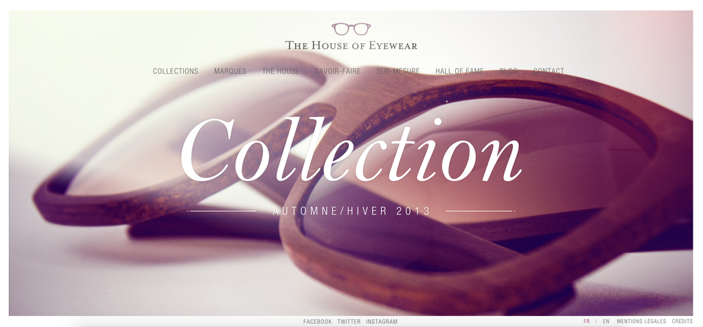
Customize stock photography in web design. Work with your UX designer to make photos more unique. Tactics like photo filters, layering, cropping, using stylised typography, adding elements and more can take the stock photo to a new level, where people would think that this is definitely related to your brand.
4. HIRE A PHOTOGRAPHER
No matter what cool images you have in your library, they will rarely be suitable for the task. You need photography in web design that has been taken for this specific purpose, by a professional and with a brief from both client and designer. To have a relevant picture with a story, that will definitely drive emotions.
5. ORIGINAL PHOTOS
Add your personal touch. Think about pictures that would reflect your identity, don’t use photos that all other companies use. Do something different, be you!
6. TRY TO STAY AWAY FROM STOCK
Use imagery to express a distinctive voice and show creative excellence. For specific content, use specific imagery. For more abstract content, be interpretive. Photographic stock is neither specific nor interpretive. Strive for images that represent your story.
7. DON’T USE IMAGE JUST TO FILL THE PAGE
Sometimes designers are tempted to use an image in a website just to have one, just to fill the blank space. Jakob Nielsen, a very known usability researcher, conducted an eye-tracking study to examine the impact of photos on websites and In his study, Nielsen discovered that participants ignored images when they there was no purpose other than to fill the page with a visual.
8. HAVE A POINT OF FOCUS
Have an iconic point of focus in your picture. Ensure that a clear concept is conveyed to the user in a memorable way. Use color and composition to give images a clear focus. Avoid making the user struggling with finding out the meaning in the image. The most powerful iconic images consist of a few meaningful elements, with minimal distractions.
9. HUMANIZE YOUR WEB, TELL A STORY
Define the mood through visual storytelling. An image that tells a story is infinitely more interesting and informative, rather than just having a picture of people smiling with no story behind it. An image that lacks a story loses an opportunity to convey mood, brand, and context. 46% of marketers say photography is critical to their current marketing and storytelling strategies
10. APPROPRIATE SIZE OF THE PICTURE
Make sure your images are appropriately sized for displays and across platforms. The pictures should not appear pixelated. They tell the story, users should fully enjoy it. Look at the quality of the pictures of apple, you really enjoy them. Test appropriate resolution sizes for specific ratios and devices. If you invest in pictures, make sure they have a high quality.
11. MAKE TYPOGRAPHY LEGIBLE ON THE TOP OF IMAGERY
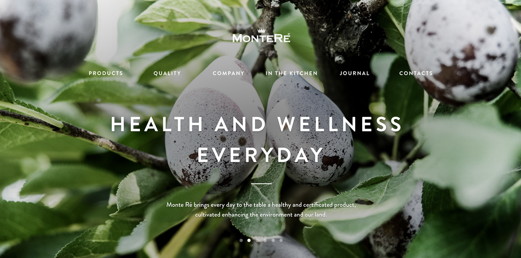
Apply text protection in the form of scrims. Gradients could be as low as 10-20% in some contexts. Dark scrims should ideally be between 20%-40% opacity depending on the content. Light scrims should ideally range from 40%-60% opacity depending on the content.
12. BLACK AND WHITE PHOTOGRAPHS
They communicate professionalism and sophistication.
13. RULE OF THIRDS
The Rule of Thirds is a method for composing the elements of an image to be visually pleasing, the way our eyes prefer to scan an image. The main idea is that an image should be imagined as divided into nine equal parts by two equally spaced horizontal and vertical lines and important compositional elements should be placed along these lines.
14. FIBONACCI SEQUENCE
Mathematics has been a part of art and design for ages. Mathematics is a good tool to produce creative and harmonic designs. The Fibonacci Sequence is a series of numbers where the next number in the series is the sum of the previous two numbers: 0, 1, 1, 2, 3, 5, 8, 13, 21, 34, 55, 89, 144. Dividing any number in the Fibonacci Sequence by the previous number will result in an approximation of the golden number 1.618 – the basis for the Golden Ratio.
15. GOLDEN RATIO
No one really knows what is so pleasing about golden ratio to our eyes. Some scientists suppose that it is a “universal” proportion that makes us accept it as a logical, harmonic, and organic proportion. It just “feels” right to our brains.There’s a common mathematical ratio found in nature that can be used to create pleasing, natural looking compositions in your design work, you can read more about it here.To find the Golden Ratio for an image you’re creating, you can apply some math to the height and width. For example, if you know that the height of your image will be 400 pixels, you can multiply 400 x 1.618 to find the width: 647 pixels.To check if your image is “golden,” you can divide the width by the height. Depending on how you divide, the golden answer will be either 1.618 or 0.618. When you crop images with the golden ratio in mind , you might also consider using the golden spiral as a guide for the shot’s composition.
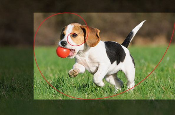
Picture is taken from: Company folders
16. CONSISTENCY IS KEY
Before choosing the images or hiring the photographer, think about what your photos should say to your visitors. What style the have, what emotions they want to drive. Do you want people in your photos? What age group should these people be? Do you want a lot of color or vibrancy? Or you want to have a neutral color palette? You want to be classic or crazy and young? Choosing a tone before you you start, will help you pick the right pictures and create a cohesive look through the whole web website.
17. PEOPLE
According to our experience web designs that include people are more persuasive than those without. Usability specialist James Breeze did an eye-tracking study that suggests that a person on a picture can guide the user’s eye on the web page. When the person faced forward, towards the viewer, the viewer rarely connected the person with the content of the web site, however, when the subject looks or points on the product or text, the eyes of the viewers follow the direction.
18. HERO IMAGE OR CARD-BASED GRIDS
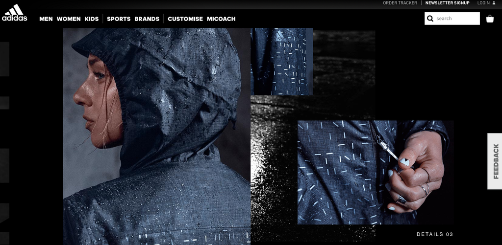
In 2016 there are 2 very strong movements in pictures usage: big pictures and card-based grids; look simple and nice.
19. PICTURES ARE FASTER THAN WORDS
When choosing an image, ask the following questions: What are the benefits of using this particular image? Does it show your product or service well? Does it add value? Does it help the user understand the point you are trying to communicate ? Does this photo drives emotions ? Does it help the customer to see himself in your story ? What is the impact of photography in web design? How does this photo relate to your brand? etc. People can recognize visuals faster that reading a short line of text.
TOP STOCK PHOTOS WEBSITES
If you have a tight budget or a short deadline, here is a list of websites, where you can find beautiful and, most importantly, natural looking photos for their web design.
- UNSPLASH
- STOCKPHOTOS
- DEATHTOTHESTOCKPHOTO
- NEWOLDSTOCK
- PICJUMBO
- MMT
- KABOOMPICS
- STOCKSNAP
- NEGATIVESPACE
- SPLITSHIRE
- PEXELS
- STOCKSNAP
- PIXABAY
- MINIMOGRAPHY
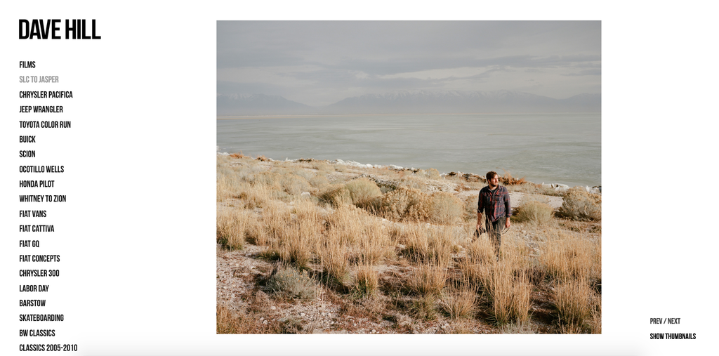
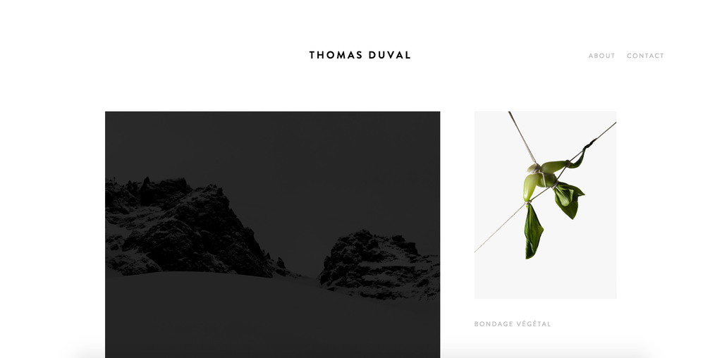
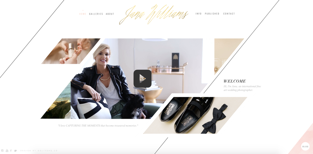
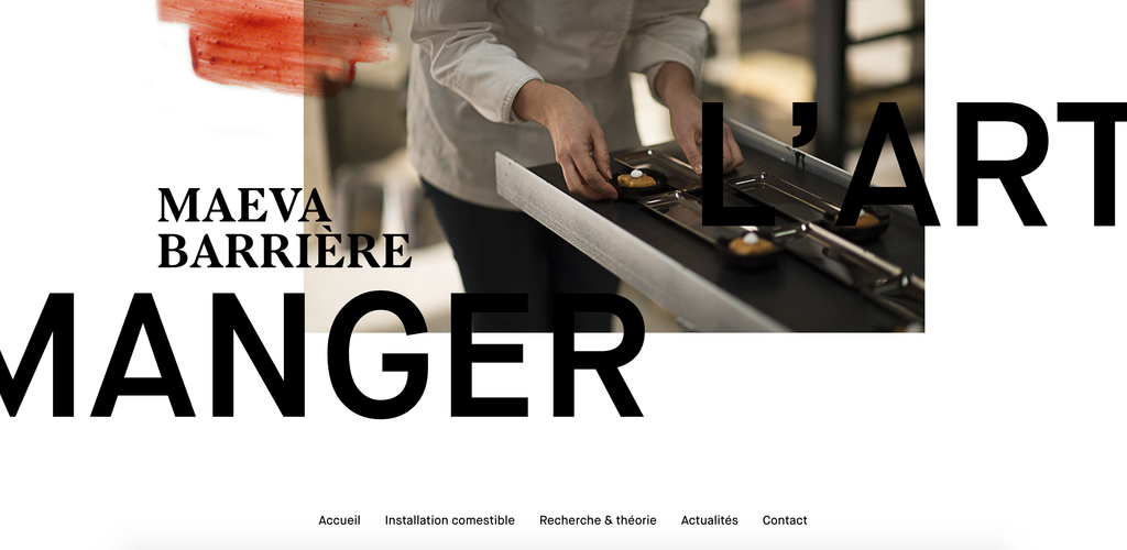
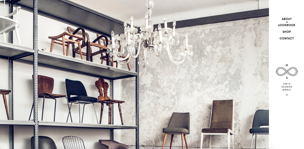
EXAMPLES OF PHOTOGRAPHY IN WEB DESIGN
If you found this article interesting, you might want to check the “finding your inner photographer:making the most of your camera” article. Enjoy!
Author
-
Ekaterina Novoseltseva is an experienced CMO and Board Director. Professor in prestigious Business Schools in Barcelona. Teaching about digital business design. Right now Ekaterina is a CMO at Apiumhub - software development hub based in Barcelona and organiser of Global Software Architecture Summit. Ekaterina is proud of having done software projects for companies like Tous, Inditex, Mango, Etnia, Adidas and many others. Ekaterina was taking active part in the Apiumhub office opening in Paseo de Gracia and in helping companies like Bitpanda open their tech hubs in Barcelona.
View all posts






One Comment
Tex Hooper
That makes sense that you want your photos to have a cohesive theme. I need family pictures taken this summer. I’ll have to hire a photographer within Utah Valley.