Table of Contents
Nowadays ui cards are heavily used in the web and mobile app design and you can clearly see it on Pinterest and on user profile websites. Several months ago we wrote articles about web design trends in 2016, for example, flat design, material design, minimalist design, etc. and we believe that card based web design should be in the top list of web design trends of this year. So let’s see why website add mobile apps are moving away from normal pages and switch to the new personalized experience – Cards.
WHAT IS CARD BASED WEB DESIGN?
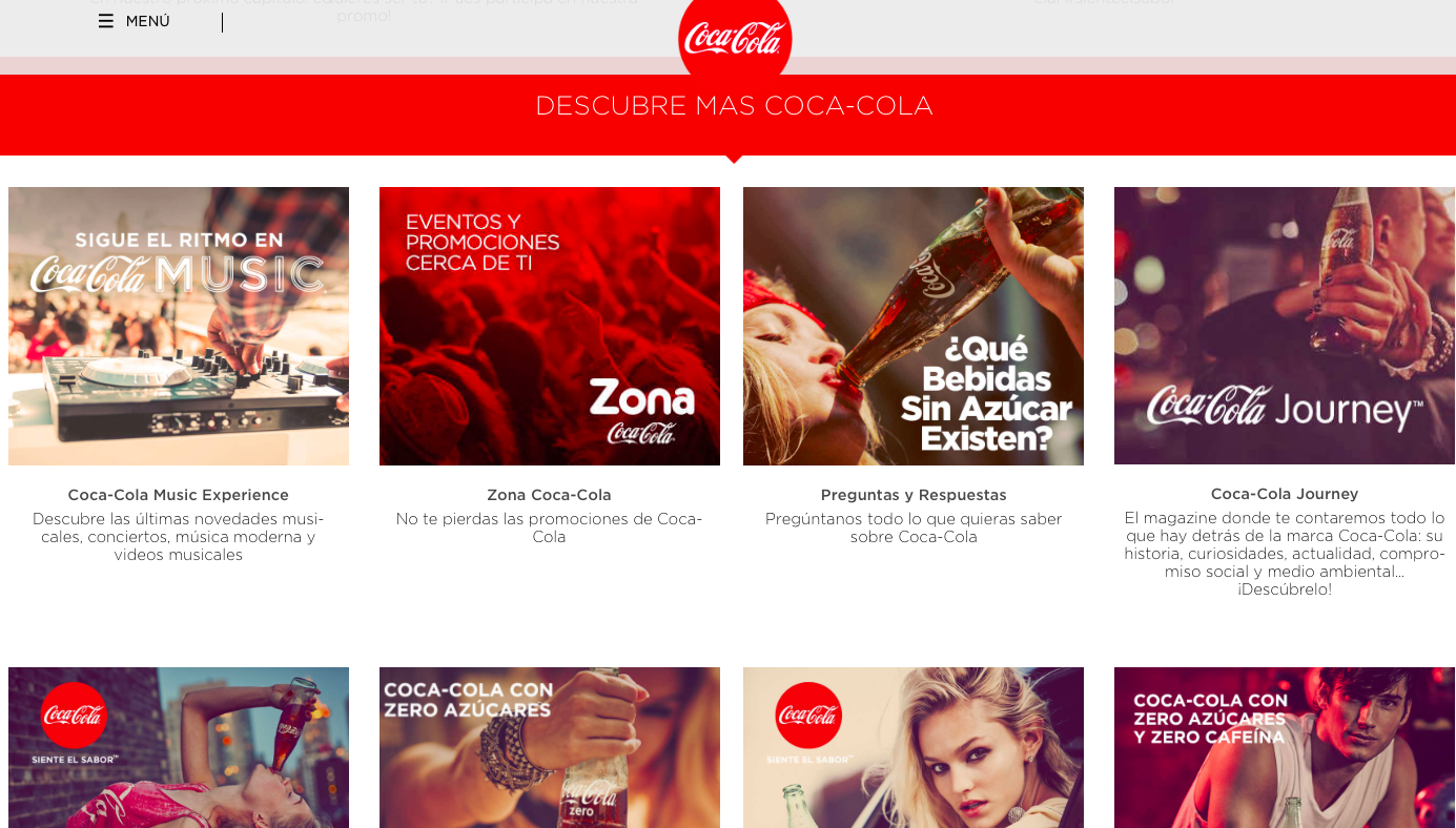
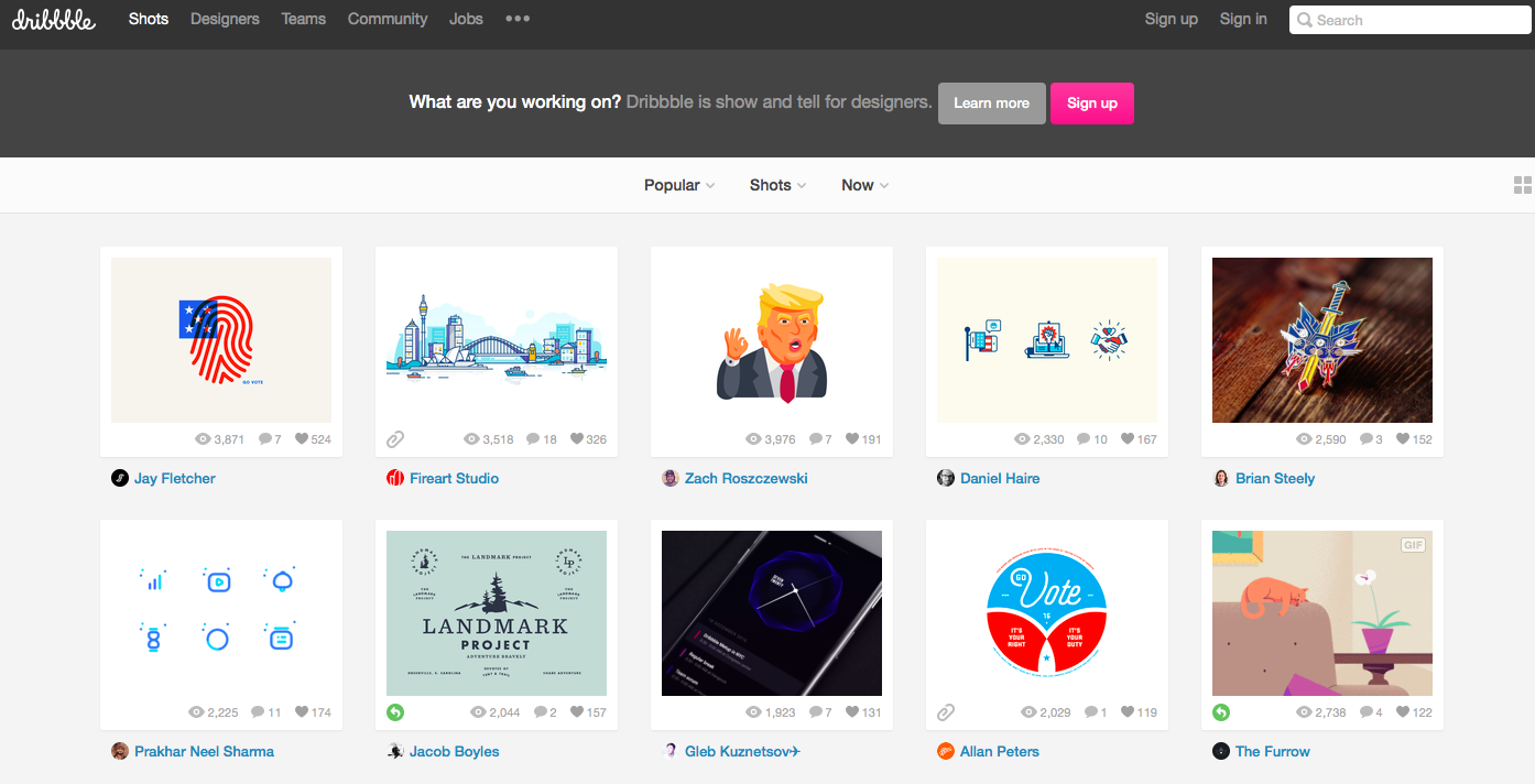
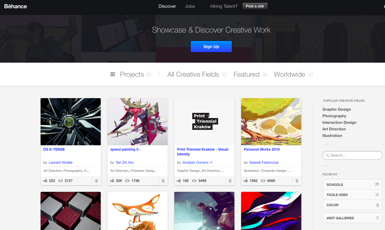
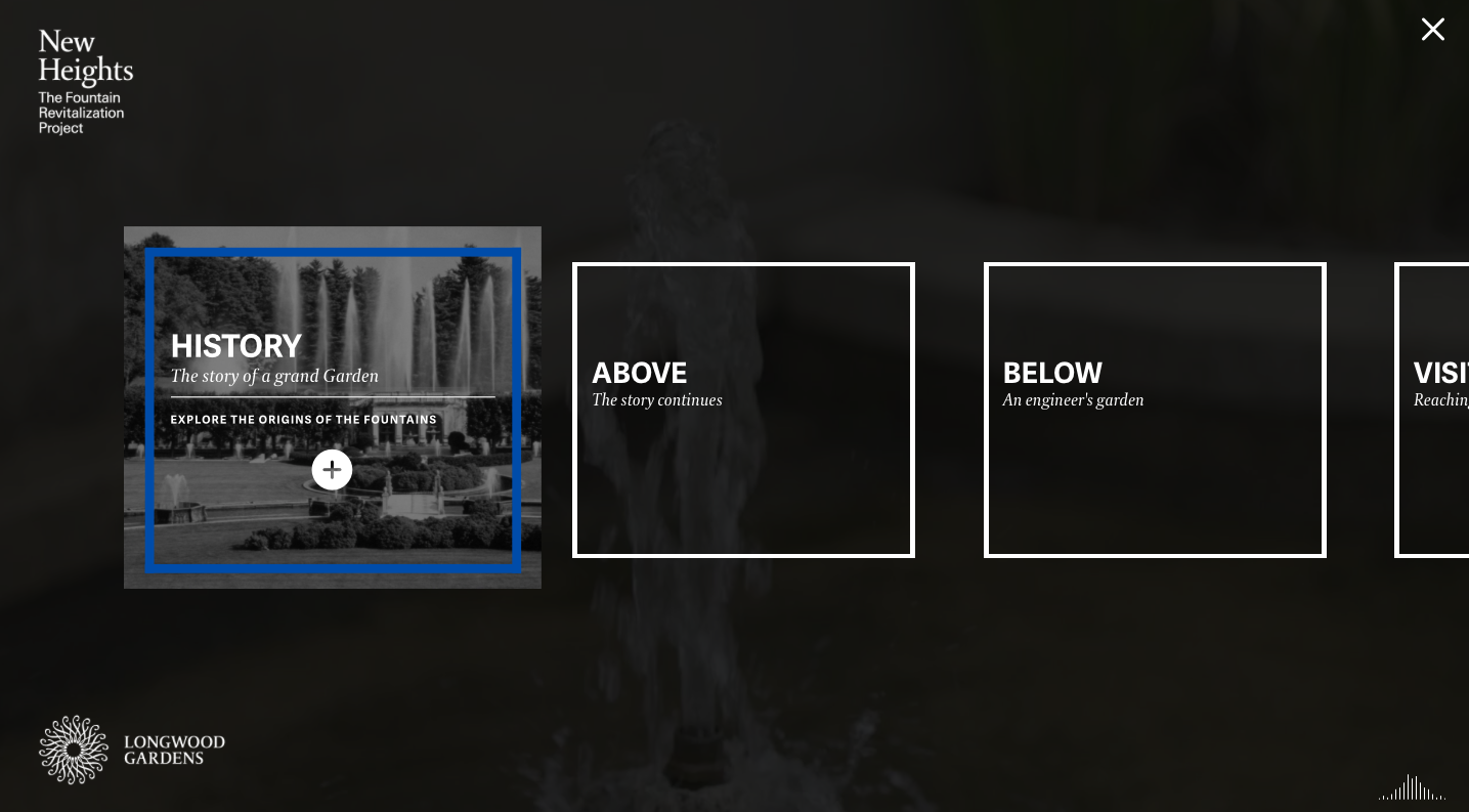
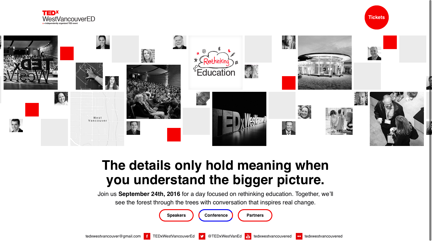
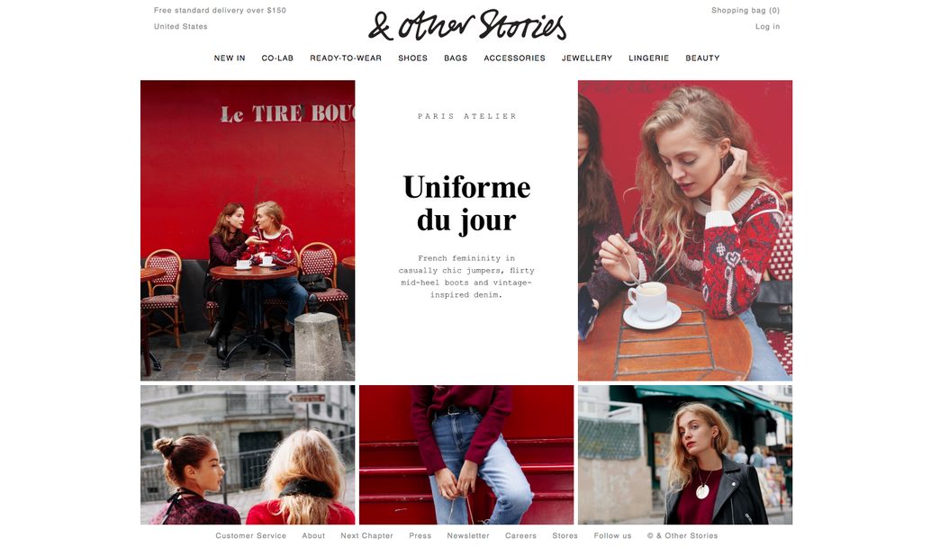
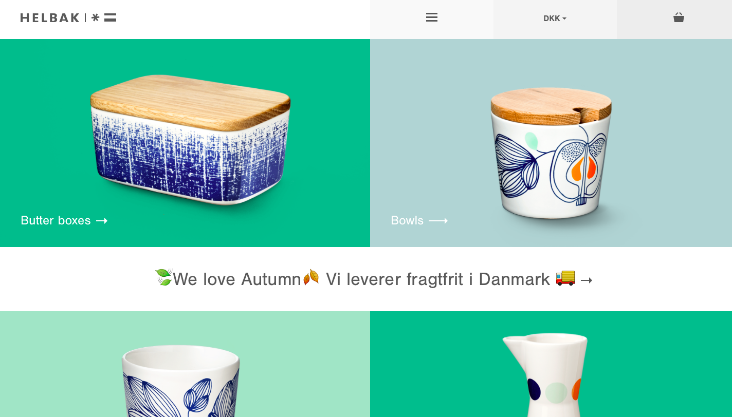
As you could get from the name it’s all about cards. Card based web design breaks down the content of a page into smaller blocks in order to focus your attention on each of them. A simple and well-known example of card-based interface is Pinterest; easy, clean and organised way of displaying several different topics to users and easy and eye-catching way to see it. So why they are so beneficial?
BENEFITS OF USING CARD BASED WEB DESIGN
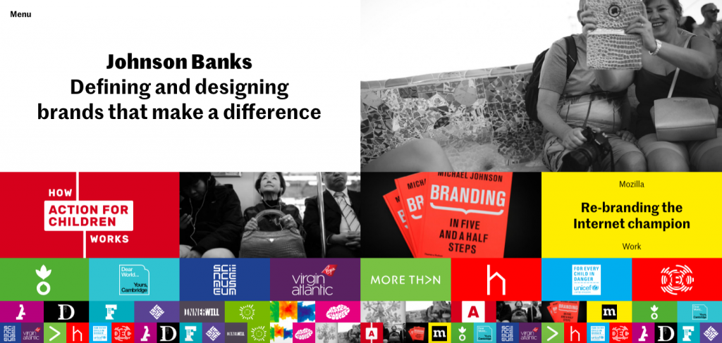
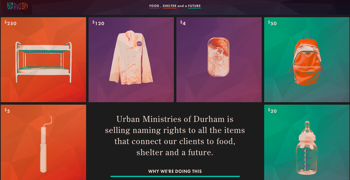
- PLAY WITH A FORM; First of all, you can play with a form, size and color depending on your wishes and priories. Cards can contain a text, a photo, a link to something else. They could have rectangle or more squared forms. They could be bigger or smaller. Cards have a freedom in the way how they may look like.
- ORGANIZED CONTENT; You should agree that a well-organized content is easier to read and go through. Here comes a card based design, cards divide content into substantial sections that cover less screen space.
- VISUAL ASPECT; It’s our nature to pay attention more to a bright and catchy side of a website or a mobile app. Cards are always noticeable. Actually, card based interface gets more engagement than any other simple page.
- METAPHORICITY; We all know about cards from the daily life: business cards, play cards and further more. Here’s the same. Cards is a great communication tool for quick stories and reactions. Let’s make a comparison with business cards. The essential information you need to know about a person is normally placed on both sides of a card.
- RESPONSIVE & MOBILE FRIENDLY DESIGN; Card based web design is ideal for both websites and mobile apps. It creates a unified aesthetic quality across multiple devices.
8 TIPS ON HOW TO USE CARD BASED WEB DESIGN BETTER
- USABILITY – Making card look stylish, remember about the usability that should be a number one priority.
- TAKE ADVANTAGE OF SIMPLE LAYERS – Try to create a sole card style for the entire interface. Find good ideas on Google material design.
- REMAIN FAITHFUL TO SIMPLE TYPOGRAPHY – When it comes to typography in card based web design, simple fonts are the optimal decision. The best option is to choose 2 fonts; one for the main body, and another for the headline or any call for action. Remember about typography’s contrast, it should be easy to find and read the content. What you can play with is a font’s size. Keep the idea of harmonic type design & easily readable card. To understand typography principles better you can check our recent article about it and get latest trends.
- LESS UI ELEMENTS – Don’t go overboard with UI elements. One card = One action. The goal of a card is not in placing everything in one place, but to catch an eye of a user with a right image and capacious words. Same goes to the bunch of user interface elements like buttons, animation and etc. Keep clean, simple and understandable.
- ANIMATION – Animation is another trend and it is everywhere now. It might be the right case to use it, but use it effectively in order to attract human’s eye. It’s a perfect tool for controlling the visual hierarchy and add some intrigue to the card’s form.
- USE A GRID – Follow this essential rule. It helps to align things correctly.
- BALANCE – Card based web design is about simplicity, but at the same time every detail makes sense and adds value. Try to achieve a balance of an informative text and engaging and informative, emotional images.
- ATTRACTIVE – Make your card based web design look more attractive and special from others. Give an eye to details. Be unique in your design, that’s the key to success.
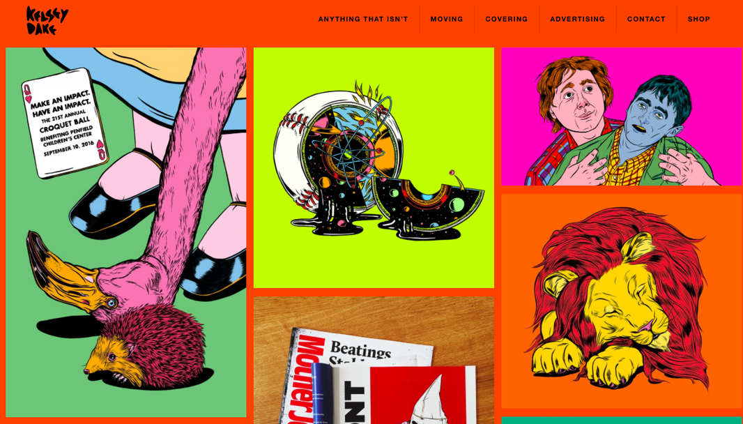
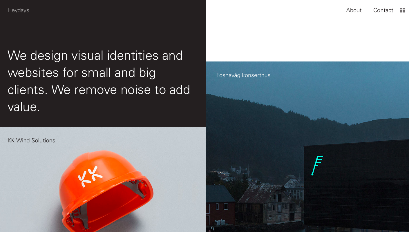
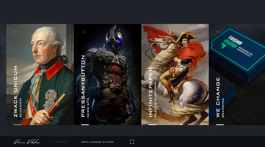
13 CARD BASED WEB DESIGN EXAMPLES
The list of examples goes on: Facebook, Twitter, Google and many others use card based web design. However, I think we are only getting started and I really believe that with this increasing trend of tablets and smartphones usage will conduce to keep cards on top of web design for long ages.
If you are interested in UX design, I recommend you to subscribe to our monthly newsletter and receive exclusive info about upcoming events, trends, news and best practices.
