Table of Contents
Creativity is important, personal touch is important, innovation is important, but all that should be based on user experience. One of the biggest causes of user failure is when users simply can’t find what they are searching for on a website or a mobile app. There is a good phrase: “if the user can’t find the product, the user can’t buy the product.” It doesn’t matter if a client got amazed by the extraordinary location of the menu, or its design by itself, if it is difficult to understand how to use it or how to find a product he is interested in, I consider it as a failure. A good design should focus on the users and their goals: finding information as quickly as possible with a good navigation menu design.
BEST PRACTICES NAVIGATION MENU DESIGN
- Position
The position of your navigation menu design is very important. People follow certain patterns when they arrive to your site. According to Nielsen, our attention on websites follows the pattern of the letter F. We focus the most on the top of a website and on the left side from where we briefly scan the main elements in the content area.
- Simplicity
The key to an effective navigation menu design is to keep it simple. No matter how many content categories you have and how many pages you need to link together, don’t don’t complicate life of your users. Make sure to set up your information architecture before you decide on a design for your menu. User testing techniques, such as focus groups and card sorting will help you to match your content to your users’ mental schemata. It is very important to group content items and define categories in a way that makes sense to your users.
- Words
After the information architecture has been defined and all content has been structured in a logical way, words play an important role for the effectiveness of your navigation menu design. You can have all the information on the right place, but if your navigation items are called differently than expected, they are difficult to find. Try to use words that your users are familiar with. Don’t invent creative categories just to show that you are creative. Choose words that are simple and to the point.
- Colors
Colors can be used in different ways to make your navigation menu design more effective and easy to use. You can highlight active menu items or build a color scheme for different content categories. This will help your users identify and recognize the different areas of your website easy.
TOP NAVIGATION MENU DESIGN PATTERNS
I think the first menu option that comes to our mind is a typical one – above the page menu, the easiest one and approved for many years that it is effective. But not creative anymore. Therefore let’s look as some others that are effective and more creative!
- VERTICAL MENU
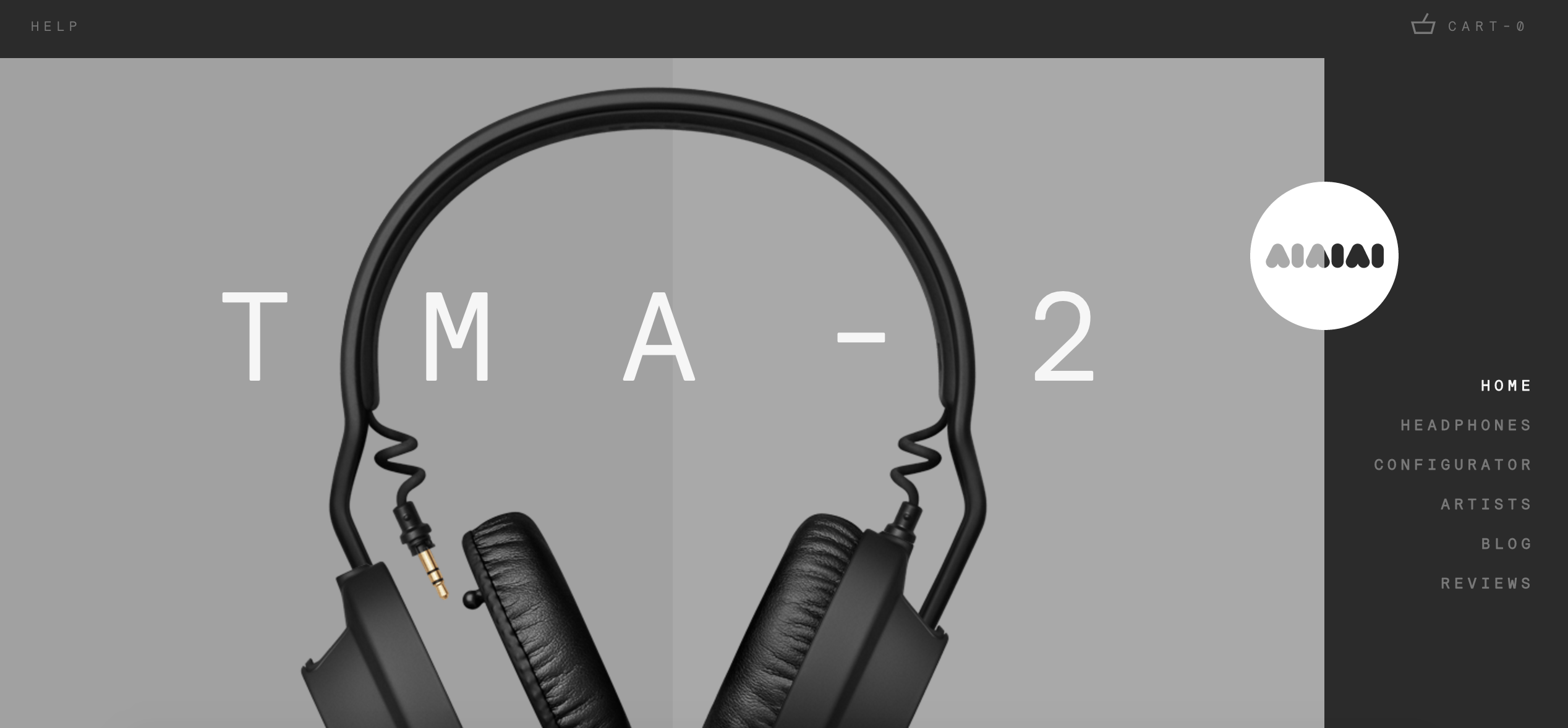
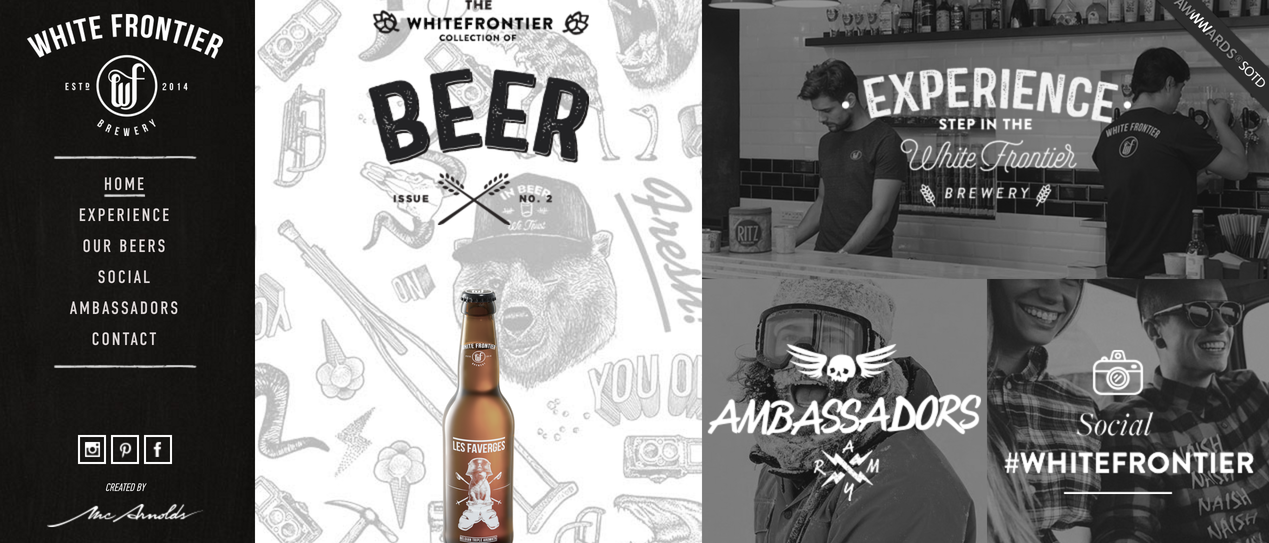
I think second option that comes to your mind right now is vertical menu, am I right? Maybe not, but it is also one of the typical ones. Normally it is placed on the left side of the page, but could be places on the right one as well, let’s look at these examples:
- DROP – DOWN MENU
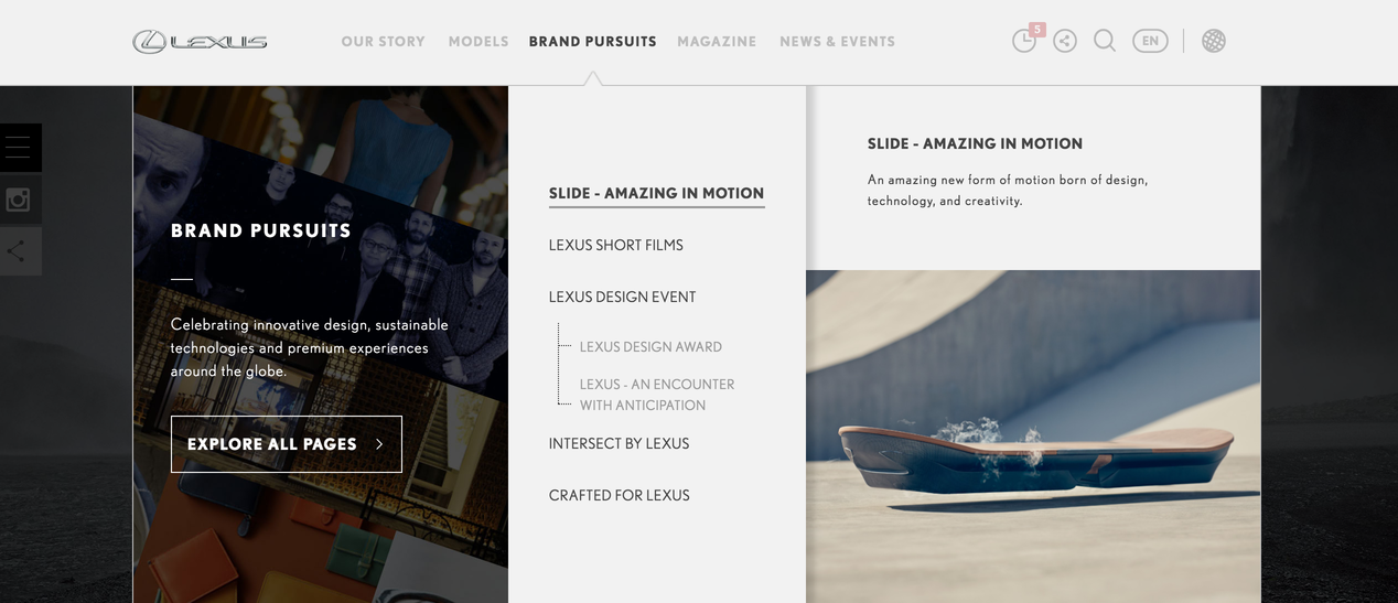
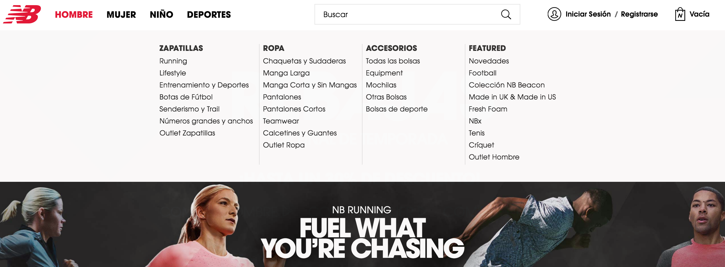
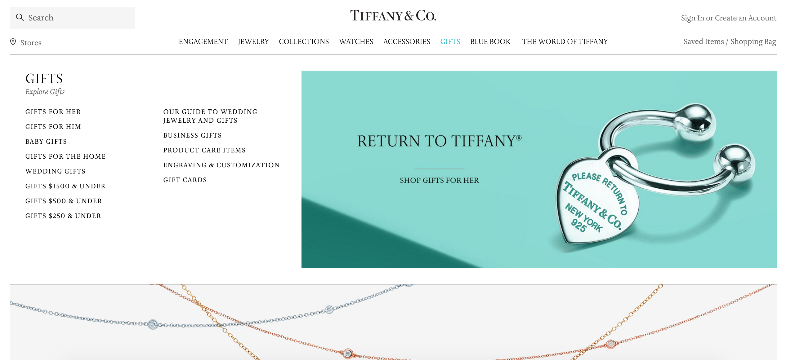
From a design point of view, drop-down menus are an excellent option because they help to keep simplicity and clean the layout. Good advice here would be: avoid a drop – down with more than two levels. Drop-down menus organize content, but if not done correctly, they can be just as bad as a messy layout. Here I have 2 awesome examples for you:
- MEGA DROP DOWN MENU
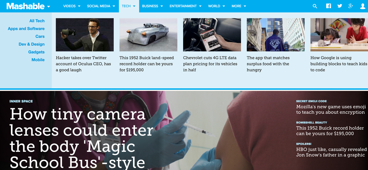
Menu system has become a location for content. This content can be used to direct the flow of users through the site. It can drive them towards the most important content. And in this way the navigation acts as a salesperson pushing the most profitable products. Or it is used to guide users to the most popular items.
- THE NAVICON MENU
For example, Facebook now is given credit for popularizing the use of navicons to hide navigation options off screen, or off canvas.
The goal of the navicon to hide the full range of navigation options. It does so on both the mobile and desktop versions of the site. To keep simplicity and focus attention on the message, content, video or photo. With the popularity of hamburger menu, navicon is normally associated with it.
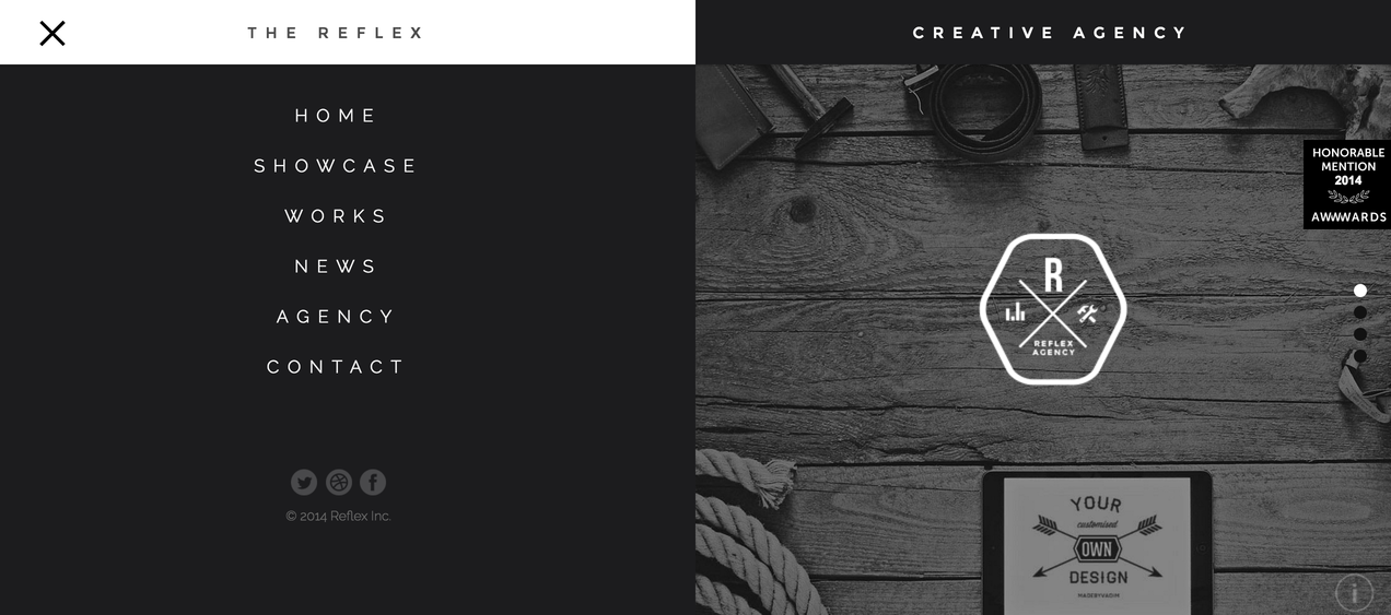
- FULL SCREEN NAVIGATION MENU DESIGN
These navigation menu design are typically activated by a button or link; quite frequently a navicon. The difference here is that instead of a small panel that slides out, the navigation takes over the entire screen. On mobile this feels normal, but on the desktop this is actually a new and interesting approach. I consider it as the perfection of the mega drop down menu.
- SINGLE OPTION HOME PAGE MENU NAVIGATION DESIGN
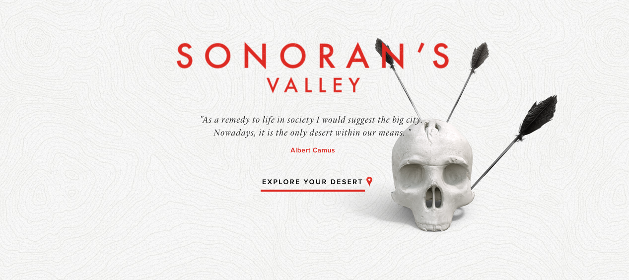
This pattern works perfectly with the long scroll. It can also act as an entry point to the rest of a multi-page site. The appeal of this pattern is that you lead your user where you want while eliminating any clutter. Usually, this pattern is seen in the home page with: title, slogan, value proposition, meaningful imagery and call to action button.
The reason why people use it is – the single-option home page makes a stronger first impression with its message.
After all, a single option is the easiest choice to make, according to Hick’s Law, discussed in Interaction Design Best Practices. Once your user makes that easy first click, they’ll already be invested in the site, and more likely to continue.
SONORANS VALLEY
There are many more others, like for example links within the text on the home page, etc, but I decided to focus more on the most popular and common ones. But don’t forget, everything you try new, you need to test first!
USER RESEARCH METHODS FOR BETTER EXPERIENCE
Helping users navigate should be a high priority for every website and application. It should be easy, it should be obvious, for example if you search for a milk, it should be in diary products, no? So make sure that all your information is splitted the right way. The way your users would search for it. It sounds obvious, but there are some topics that could be put in different sections and do a research and make sure what the majority of your target thinks.
The key to identifying the true cause of a problem is to combine multiple testing methods:
- TREE TESTING
A tree test is a technique conducted to determine if mission-critical information can be found in the web or a mobile app. It does not display the user interface to test participants; they navigate using only link names.
Questions to answer
Are the names of categories understandable?
Are the category names represent the content?
Is content categorized in a user-centered manner?
Are content titles distinguishable from one another?
Is information difficult to find because the structure is too broad or too deep?
Setup and testing
You need to create an information-architecture tree, which shows the groupings and hierarchy of pages. You then create specific tasks that involve finding specific destinations, for example order a flight for 1 person, who is 55 years old to Paris for 15th of July and costs less than 100 euros. Study participants conduct the tasks using the tree.
Results
The results are quantitative and include:
Direct success rate: How many participants found the right answer without having any difficulties ?
Indirect success rate: How many participants got the right answer, but had to navigate back up and down the tree to find it?
First-click data: Which categories did users click first? First clicks are a good indicator of the strength of category names.
Tool: Treejack
- CLOSED CARD SORTING
Closed card sorts is a method to evaluate the strength of category names.
Questions to answer
Are the names of categories understandable?
Are the category names represent the content?
Is content categorized in a user-centered manner?
Are content titles distinguishable from one another?
Setup and testing
To conduct this type of test, you provide participants with cards including names or descriptions of content/functionality. Then they must assign these cards to your categories. Such closed card sorts are the opposite of traditional open card sorting where users get the same stack of cards but have to create the categories themselves.
Results
The results are both quantitative and qualitative, and include:
Similarity: Number of times the same content was grouped together
Standardization Grid: Number of times a card was sorted into your intended category
Logic of assignment: interviewed users make you understand why they grouped certain content together, why they assigned items to particular categories, and how they interpret the category names.
- CLICK TESTING
Click tests are conducted to determine where users click on the interface to find specific information or functionality. One drawback of click tests is that they are not interactive: participants are shown static images of a site and must show where they’d click to perform a task. However, once they click, the task is considered finished and they can move to the next task.
Questions to answer
Which navigation components are utilized?
Which navigation components go unnoticed?
Which navigation components are avoided?
Setup and testing
To conduct this type of test, you upload a screenshot, wireframe, or sketch of a page into a click-testing tool. You then create tasks. Participants must click on the image to indicate where they would go to conduct the task.
Results
The result is a heatmap illustrating where users clicked. The heatmap helps you determine if the navigation design is noticeable or if elements are conflicting and create too much noise.
- USABILITY TESTING
Usability testing is conducted to determine how and why users navigate a website to conduct tasks.
Questions to answer
How do users find information?
Which navigation components are utilized?
Which navigation components are unnoticed?
Which navigation components are avoided?
Setup and testing
To conduct this type of test, you can use prototypes or a live site. You then create tasks and ask participants to carry out the tasks. You observe users conducting the tasks and note when they interact with navigation components, how they interact, and if they avoid or overlook navigation.
Results
The results include task success rate and difficulty ratings, identification of interface elements that cause friction, and better understanding of the users’ mental models of the site.
Tool: In-person testing, remote moderated tests with services like Webex
And there are many more user research methods, which you can find here. And of course the importance of it.
We should elevate our thinking of navigation and really embrace the influence it has on the experience of using the web sites we create. Unfortunately, too often I find that navigation is a bit of an afterthought. But in my opinion, it should be among the most considered elements in the design.
If you like our articles, subscribe to our monthly newsletter!
Author
-
Ekaterina Novoseltseva is an experienced CMO and Board Director. Professor in prestigious Business Schools in Barcelona. Teaching about digital business design. Right now Ekaterina is a CMO at Apiumhub - software development hub based in Barcelona and organiser of Global Software Architecture Summit. Ekaterina is proud of having done software projects for companies like Tous, Inditex, Mango, Etnia, Adidas and many others. Ekaterina was taking active part in the Apiumhub office opening in Paseo de Gracia and in helping companies like Bitpanda open their tech hubs in Barcelona.
View all posts
