Table of Contents
Websites have changed a lot over the last years. Now, internet user is more picky and demanding than ever before and you need to come up with an idea on how to catch user’s attention and how to impress him. One of the options and trends is – parallax scrolling; a technique in web design, which makes elements on a site scroll at different speeds creating a dynamic effect. This method in design is based on creating an illusion, which makes a visitor scroll through the complete site having impression that he is following a story and he is a key player here. Today I would like to go over the common errors in parallax scrolling and I would like to share 6 great parallax scrolling examples!
Parallax scrolling can make a content more engaging, it helps users understand a brand’s message better, and have an overall better experience. But there are some cautions that you need to take into account:
Common parallax errors; 4 cautions to keep in mind.
1. SCROLLING TIME
It is extremely important to do it smartly as according to user testing, parallax scrolling shouldn’t be longer than 2 minutes. And according to the same report if a company do it user oriented and engaging, almost all of the users would be willing to share this website on social media.
2. PAGE LOADING TIME
Some sites that use parallax scrolling often put a lot of their content onto one page, don’t do that as things like animation and layered imagery can result in longer intervals between clicking and loading, causing annoyment and user dissatisfaction. Visitors are impatient while browsing. According to user testing report, If a page is taking too long, regardless of the content value, it is not worth the actual time it takes to view. To solve this problem, it’s smart to keep your pages minimalist and this is actually very good as in 2016 minimalist style is a trend! Another tip – use vectors instead of PNG or JPEG that wouldn’t slow down the site’s loading time.
3. MOBILE VIEWING
Parallax scrolling does not go well on mobile devices. If you’re investing in a parallax to do your webpage more memorable and engaging, you need to adapt it to the mobile device as well as most of the searches are done now on smartphones. Do your website responsive, but a lot of elements should be adapted as well.
4. SEO
With parallax scrolling pages, you need to be prepared, you many loose page rankings and possibly your organic traffic. Having one page rather than several means that you’re looking to rank for all your keywords on a single page. This will be a lot harder than ranking for one or two on multiple pages. Also, you won’t be able to update your site’s content that often. Link building is an essential part of SEO and normally in parallax sites there are almost no internal and external links, at least much more less than in the normal one, but what is good about parallax is that these webpages are magnets for back links because of their uniqueness and creativity, but if you count on that, you really need to come up with excellent user flow, visuals and story! Stand out from the crowd, don’t be similar to someone else otherwise you have many chances to fail. I would recommend to add parallax to selective parts of your pages to illustrate smaller stories rather than larger narratives. Don’t forget to use basic navigation menu of the page, which wouldn’t detract users from the design. Parallax websites increase page views and overall traffic and the biggest advantage is improved engagement. With more engagement, comes more feelings and in 21st century feelings are competitive advantage!
Let’s look at more advantages of Parallax Scrolling:
10 advantages of parallax scrolling
- Make your visitors curious
- Short scrolling is enjoyable
- Makes your site look creative, modern, and cool
- Users are directed down your page; it directs visitors to call to action
- Website users are willing to recommend these kind of web pages on social media
- Engagement; the user is entertained and involved
- Storytelling
- Users learn more about a product and a company
- Plain usability is not enough anymore to make the difference, you need to get to your visitors on an emotional level in order to stand out from your competitors.
- Encourages longer page visit time as users are more interested to scroll the whole page and see the whole story
For web designer, marketer, product owner or a CEO it is really important to stay updated with all the latest design trends and to know how to use them in an effective way. Parallax effect may lead to rich and engaging user experience with seamless navigation. When it is used poorly, it can result in just a page with a lot of elements moving around and a terrible UX. If consider to use a parallax effect in your next web design project, I have chosen some great parallax scrolling examples to inspire you.
6 inspiring parallax scrolling examples for design
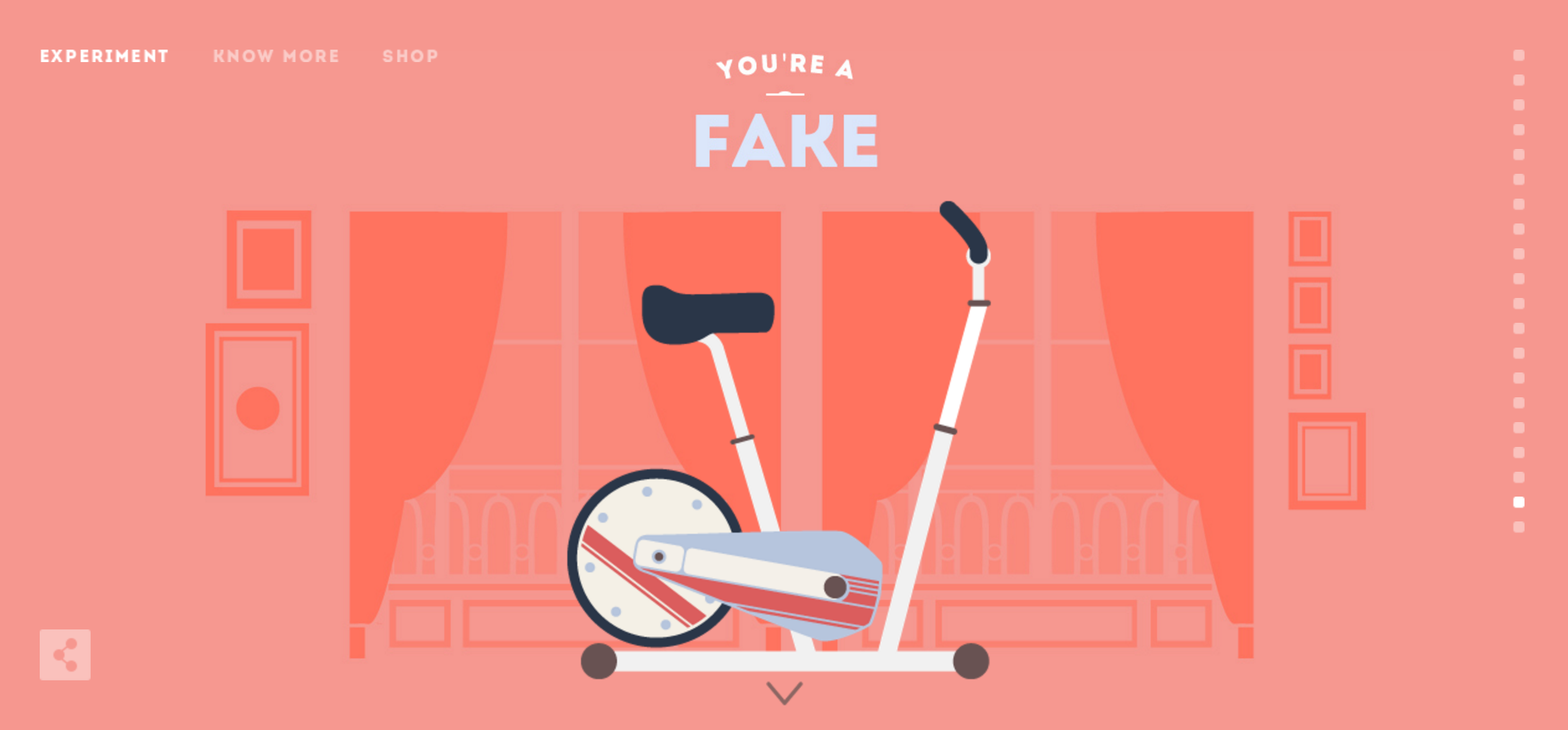
1. CYCLEMON
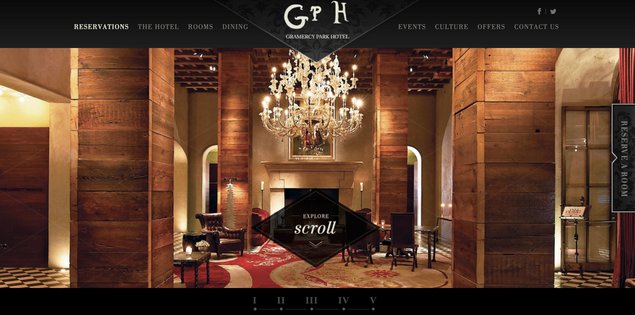
2. GRAMERCYPARKHOTEL
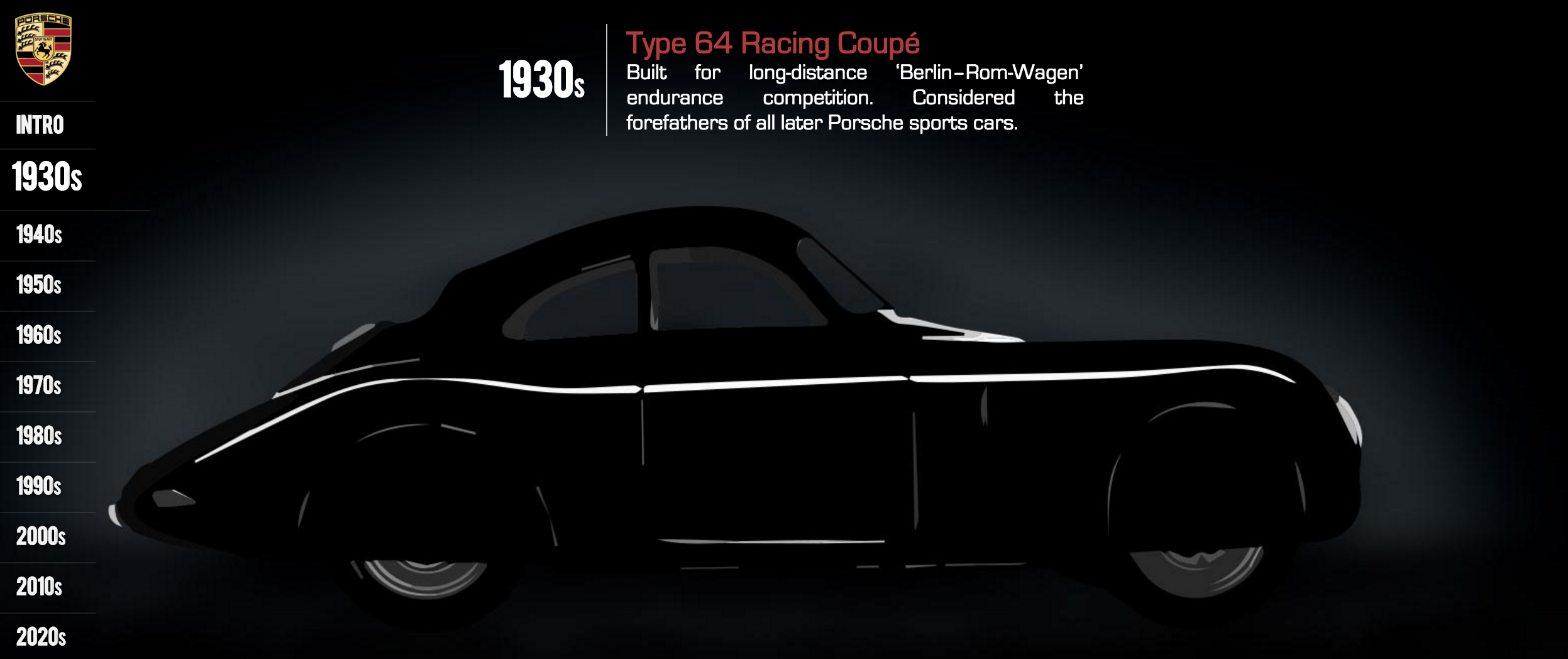
3. PORSCHEVOLUTION
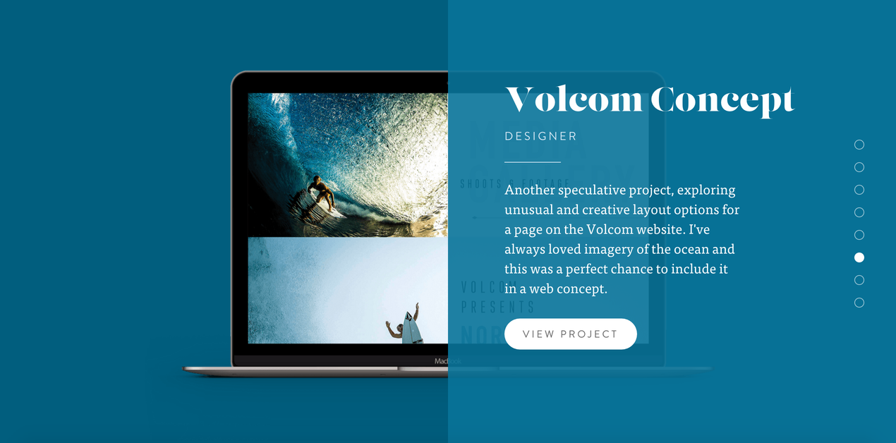
4. NRLY
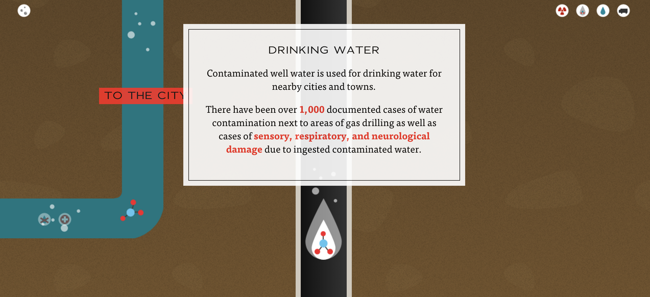
5. DANGERSOFFRACKING
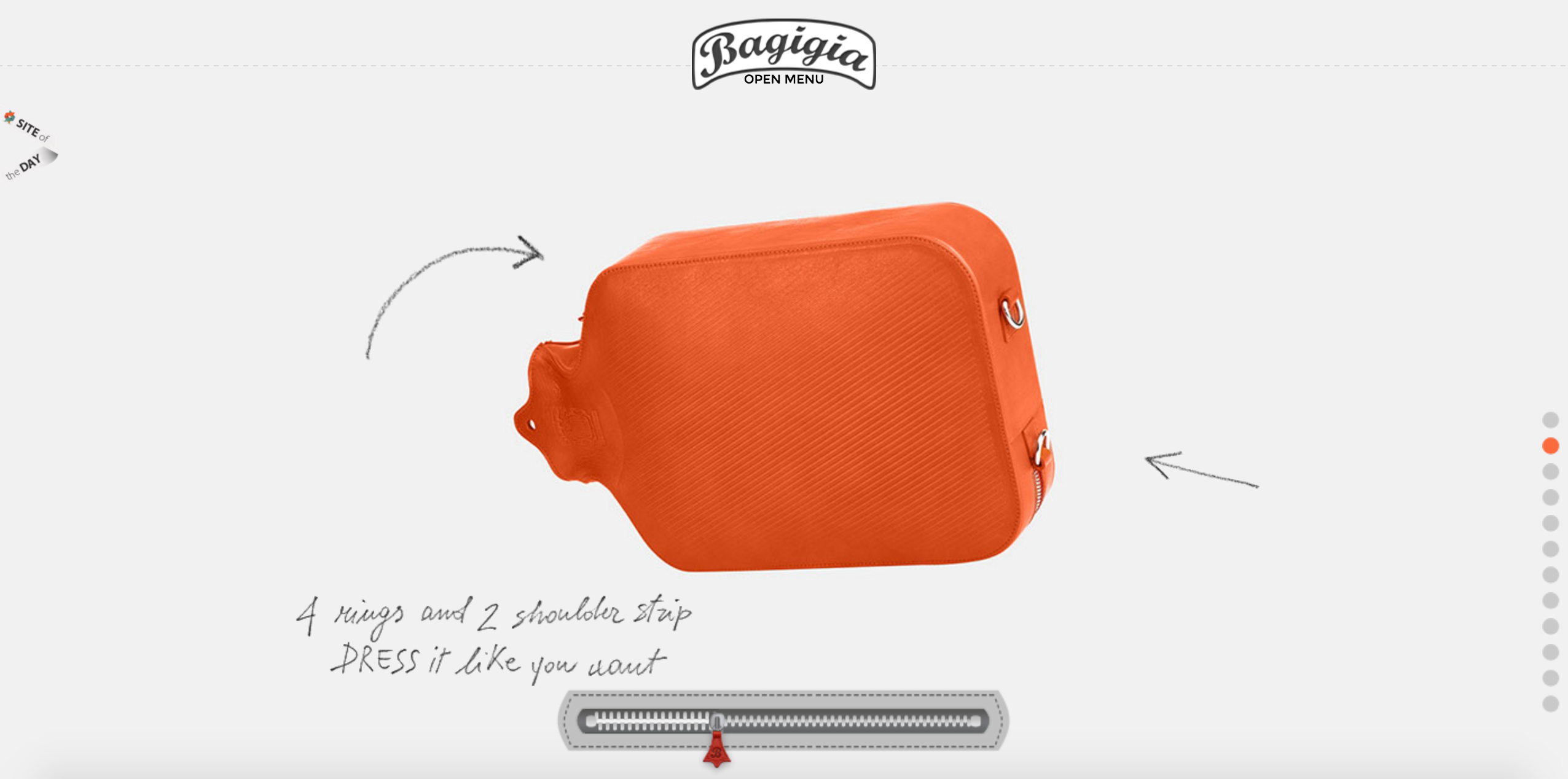
6. BAGIGIA
As you’ve seen with the parallax scrolling examples I just shared, there are many different parallax websites that are classified as great parallax scrolling and well-known companies like Nike, G-star raw, Sony, Honda CR-V,Range Rover etc use it as well. Parallax pages are great when they’re just one of many design elements on a Web site. I would recommend you to feature parallax on the homepage and link to non-parallax pages that support it instead of creating a single-page web site. You can then optimize keywords for each page, and the non-parallax pages can contain the main content content. That solves the problems with both SEO and page-loading times. As for the mobile devices, do the website responsive but think twice and use parallax only if it moves your story forward. Don’t use parallax effects just to wow other designers or win awards. You need to remember that parallax is effective only on big screens, on mobile devices it loses its “ wow” effect and it is not the best choice if users are looking to accomplish clear-cut tasks. On the other hand, parallax is a strong choice for sites aiming to immerse users in a visual narrative and to involve them in a brand story.
Author
-
Ekaterina Novoseltseva is an experienced CMO and Board Director. Professor in prestigious Business Schools in Barcelona. Teaching about digital business design. Right now Ekaterina is a CMO at Apiumhub - software development hub based in Barcelona and organiser of Global Software Architecture Summit. Ekaterina is proud of having done software projects for companies like Tous, Inditex, Mango, Etnia, Adidas and many others. Ekaterina was taking active part in the Apiumhub office opening in Paseo de Gracia and in helping companies like Bitpanda open their tech hubs in Barcelona.
View all posts
