Table of Contents
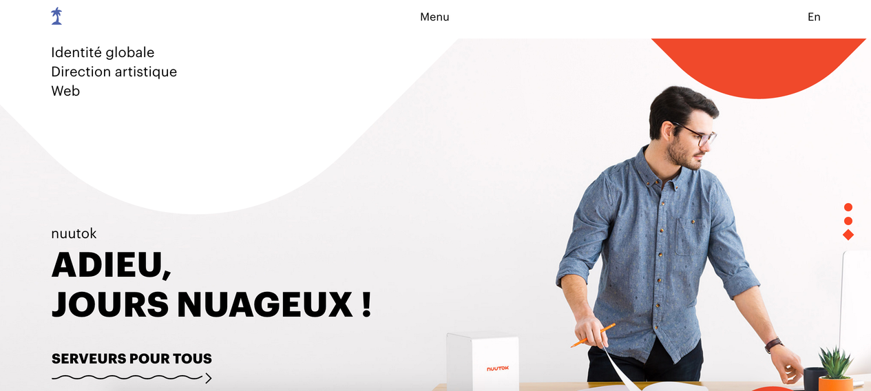
With the hard use of smaller devices, such as tablets and smartphones, it’s become essential to make sure your design can be seen. And one of the ways is going bold. Designers change colors quite often based on trends and periods, this is the decade of vibrant colors when it comes to web & mobile app design.
The main trends are still: Modern- Retro Style and Minimalist Flat & material design. The main element in these trends is vibrant colors and bold color.
Designers who use vibrant, bold colors come up with unexpected color combinations, getting inspired by urban architecture, travel, nature, and art.
Artists, who are known for bold color usage played an influential role in design trends, for example Matisse, Picasso and Frank Stella, Esther Stewart, and Sam Falls.
This year we also became bright and bold changing cour corporate color and we are very happy about that. It made us fresh and modern. Showing our tech essence.
Vivid brights represent excitement and optimism. Red, orange, pink, bright green, blue, and purple have become the key colors of web and mobile app design projects in many industries.
The result is a beautiful rainbow of bright, energetic, and fun colors that, when used well, provide emotional direction for the design and visually emphasize key content and CTA buttons. Brighter ones have higher conversion rates.

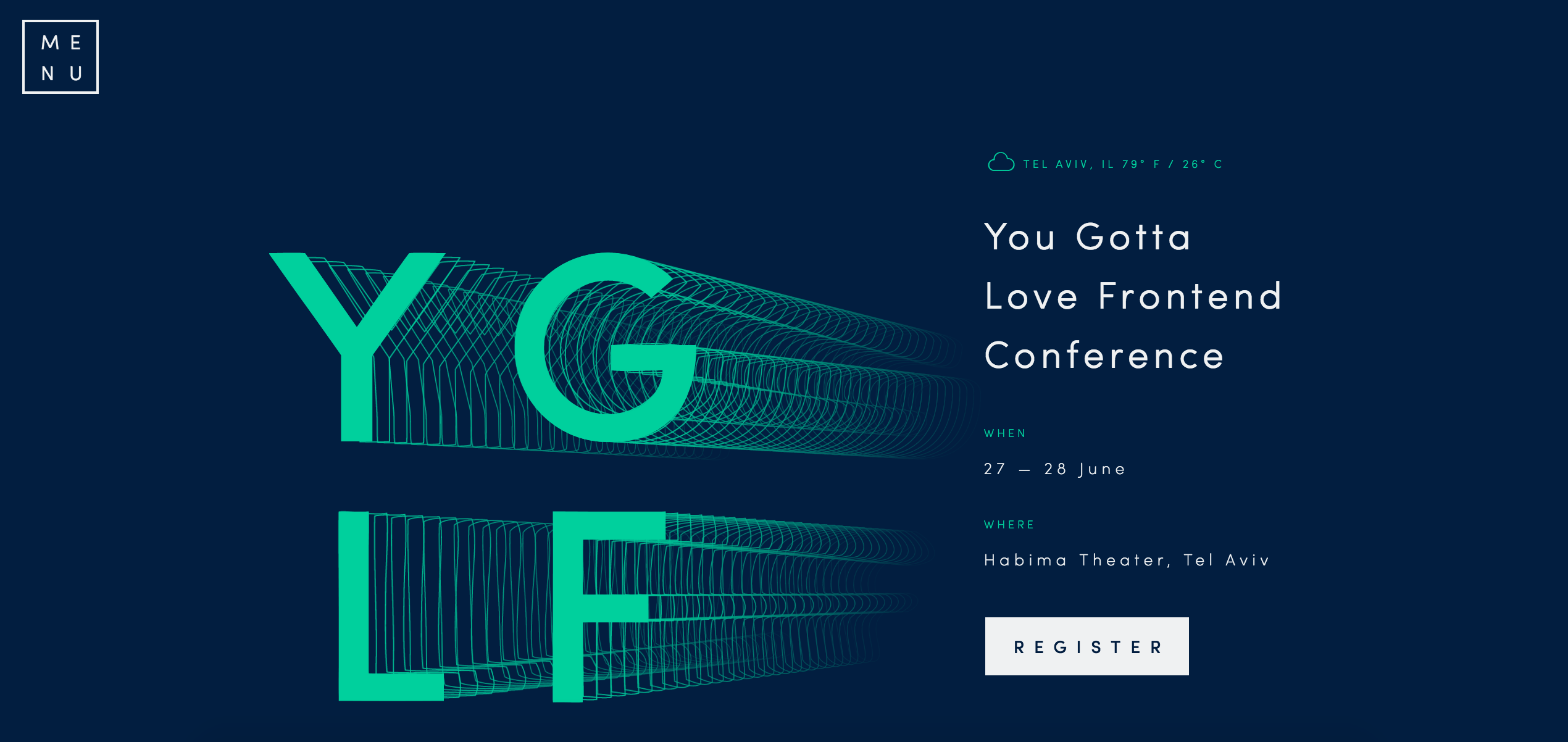
These fearless color palettes are not for everyone, but the trend is versatile enough where designers can choose how they want to use vibrant colors, for example full page design with a magenta background or kelly green lettering on a black and white background.
When combined with bold typography, bright, vibrant colors create a cool visual for websites that do not have many images or illustrations. It makes websites and mobile apps alive. Just two simple elements can create a powerful and memorable design.
One of the most popular ways to use vibrant colors is a monotone color palette; using a single color with a mixture of tints and tones to create a unified and creative, visual design.
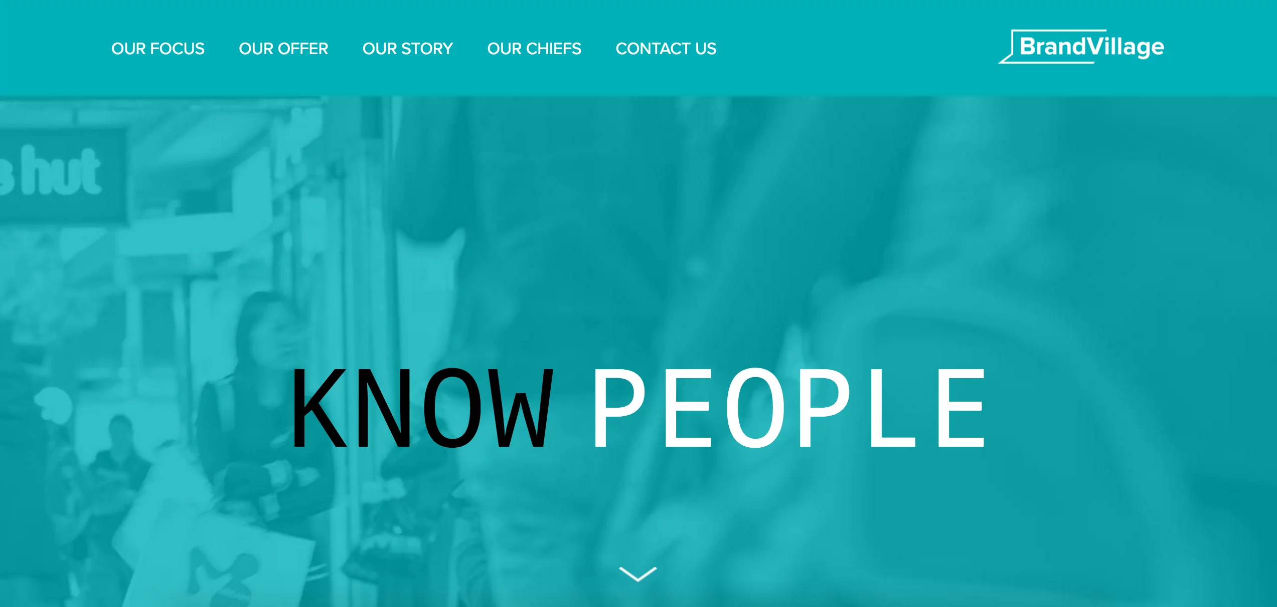
Also, it became very popular to use bright, vibrant colors over images and video backgrounds.
In 2016 bright colors lost their stigma of silliness and started to be accepted as professionals.
What started as a trend for only crazy and creative sites like artist portfolios, today bright colors are being implemented in more mainstream and traditional industries like news, weather sites, corporate sites, etc.
6 Vibrant colors & bold web designs for your inspiration
Using bright, bold colors can often be risky, as the colors can create an overwhelming effect. So it has to be done with care.
There are so many examples of designers who have brilliantly used bold & vibrant colors in their mobile app and web design projects to make the page or page elements pop and create a wow effect.
Even in some cases when designers prefer to have a more minimal design, they still use bold colors to create a memorable, fantastic look in a very simple way.
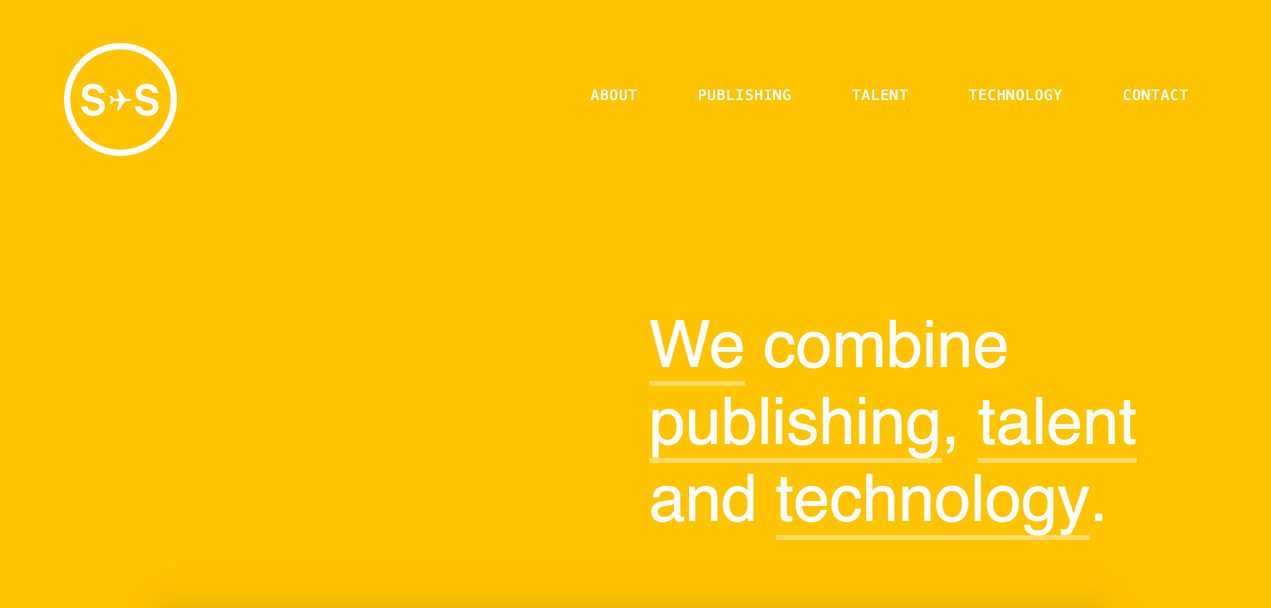
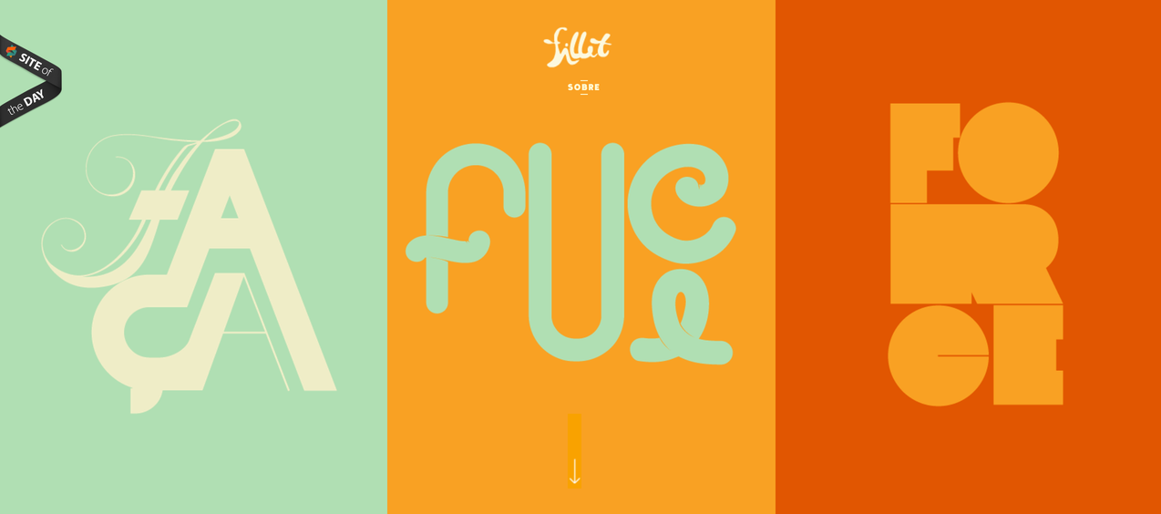
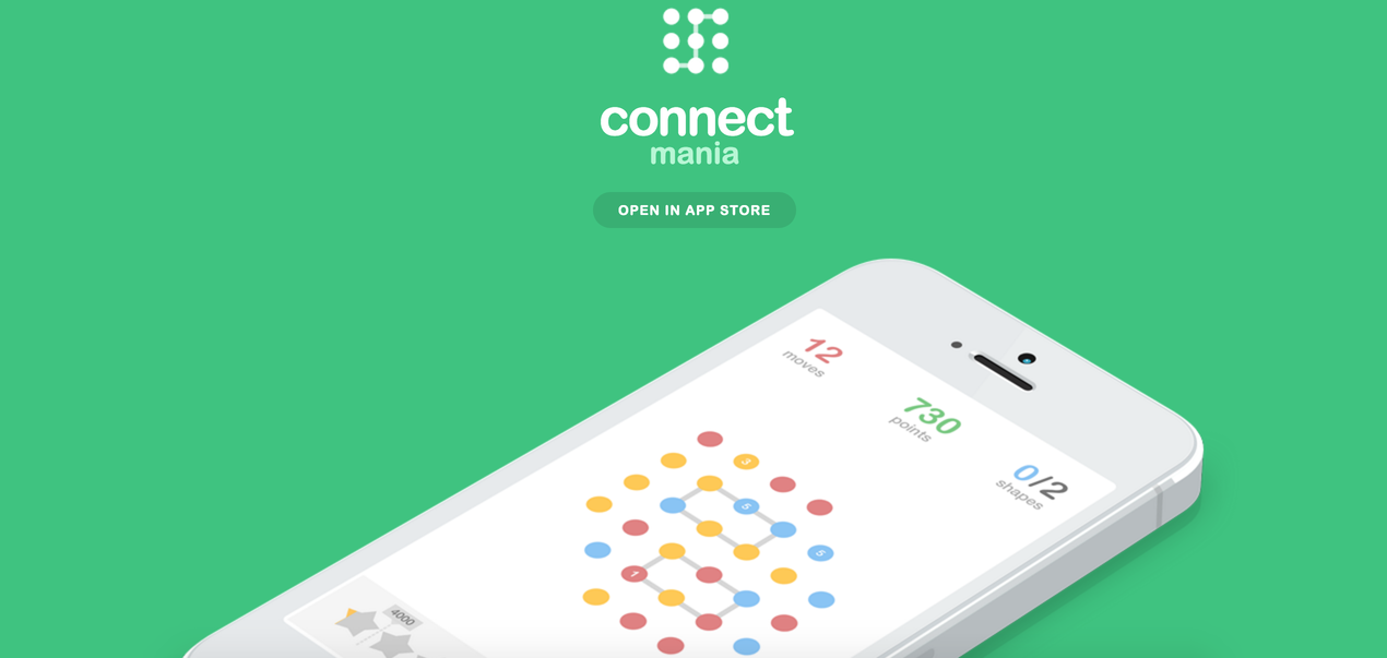
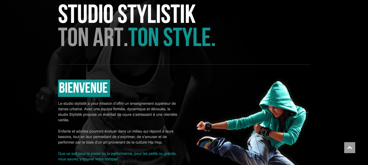
Here, we collected very cool sites where the designers found a nice balance using bold and vibrant colors. From headers to backgrounds to calls to action and beyond, these bold and beautiful uses of color in web design will inspire you to find your way to use this powerful element in your next mobile app or web design project:
Author
-
Ekaterina Novoseltseva is an experienced CMO and Board Director. Professor in prestigious Business Schools in Barcelona. Teaching about digital business design. Right now Ekaterina is a CMO at Apiumhub - software development hub based in Barcelona and organiser of Global Software Architecture Summit. Ekaterina is proud of having done software projects for companies like Tous, Inditex, Mango, Etnia, Adidas and many others. Ekaterina was taking active part in the Apiumhub office opening in Paseo de Gracia and in helping companies like Bitpanda open their tech hubs in Barcelona.
View all posts

