Table of Contents
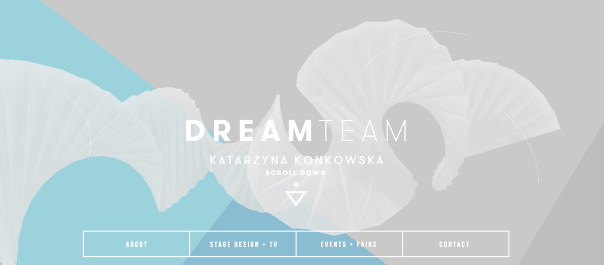
Flat design is a current trend and a buzzword these recent years. Everything is going towards simplicity and flat design is all about that. Like all other trends, Flat design has evolved and adapted changes. It is mostly being criticized for having no obvious evidence whether the object is clickable or not. On Flat websites all elements look flat and plain, and designers and digital marketers usually have to give hints to identify clickable and functional objects. Google went one step further and introduced Material Design language.
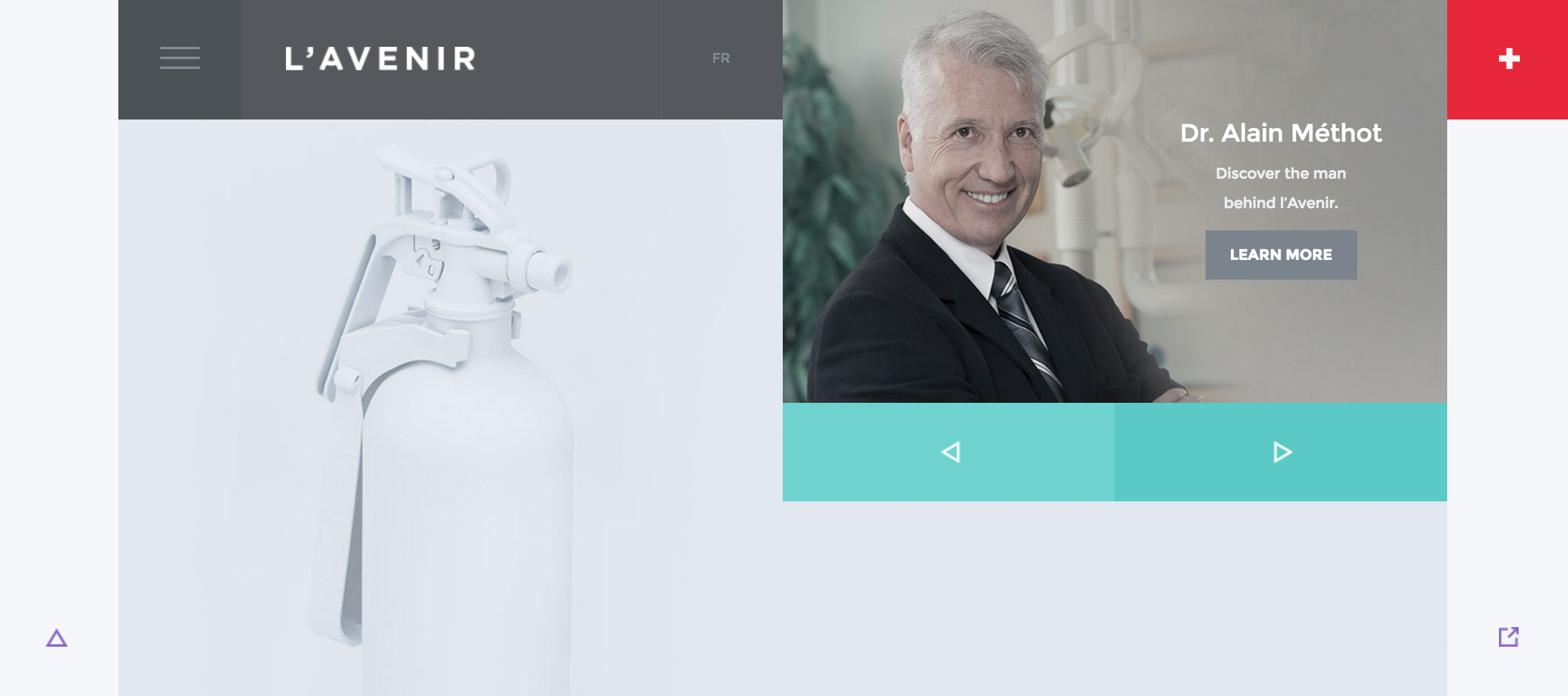
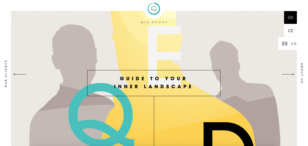
Google incorporated shadow effects and the concepts of movement and depth in order to create design that appears more realistic to the user. Material design gives more depth to flat design by incorporating light and shadows, while featuring grid-based layouts and responsive animations.
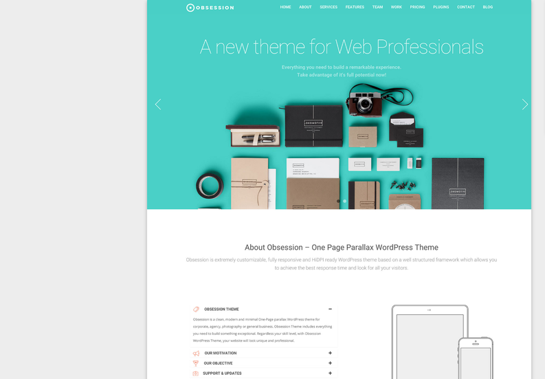
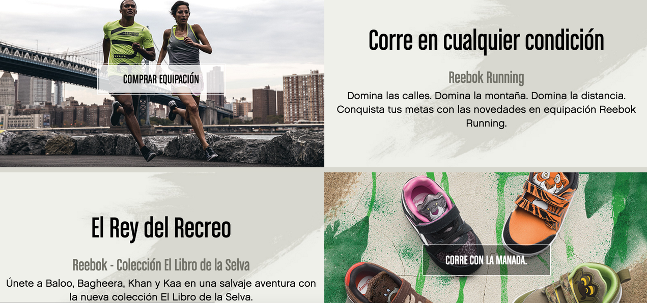
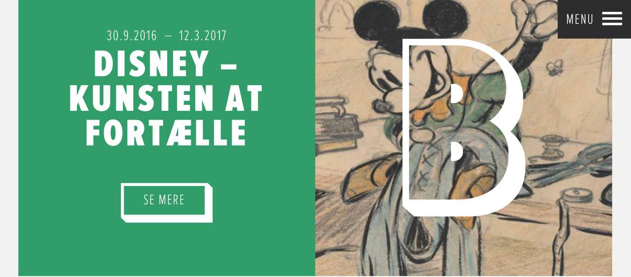
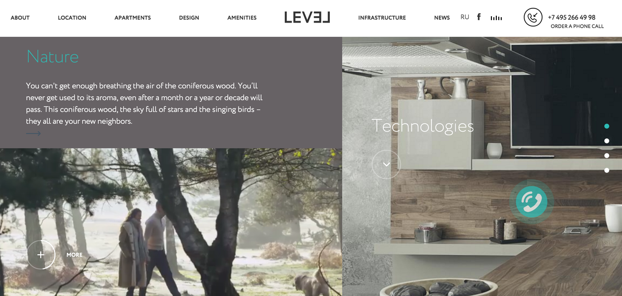
It is known for its minimalistic look, well-thought vivid colors, cool images, big typography, and whitespace usage for a bold look.
Material design is very consistent, coherent and thoughtful. Apart from simple and beautiful design, functionality is the key focus of it. Every element of this design trend has its own function. Due to Google’s design principles these functions are clearly identified. You can easily distinguish clickable elements from non-clickable ones.
It has a positive impact on conversion rate and user satisfaction. One of the example can be project management tool – Trello, which integrated this design and received 42% more activity per session.
The goal of Material Design is to create clean, modernistic design that focus on UX.
MATERIAL DESIGN GUIDELINES
Google offers a lot of resources for designers, including layout templates and icons. To get started, visit the Google Material Design Guidelines here.
ICONS
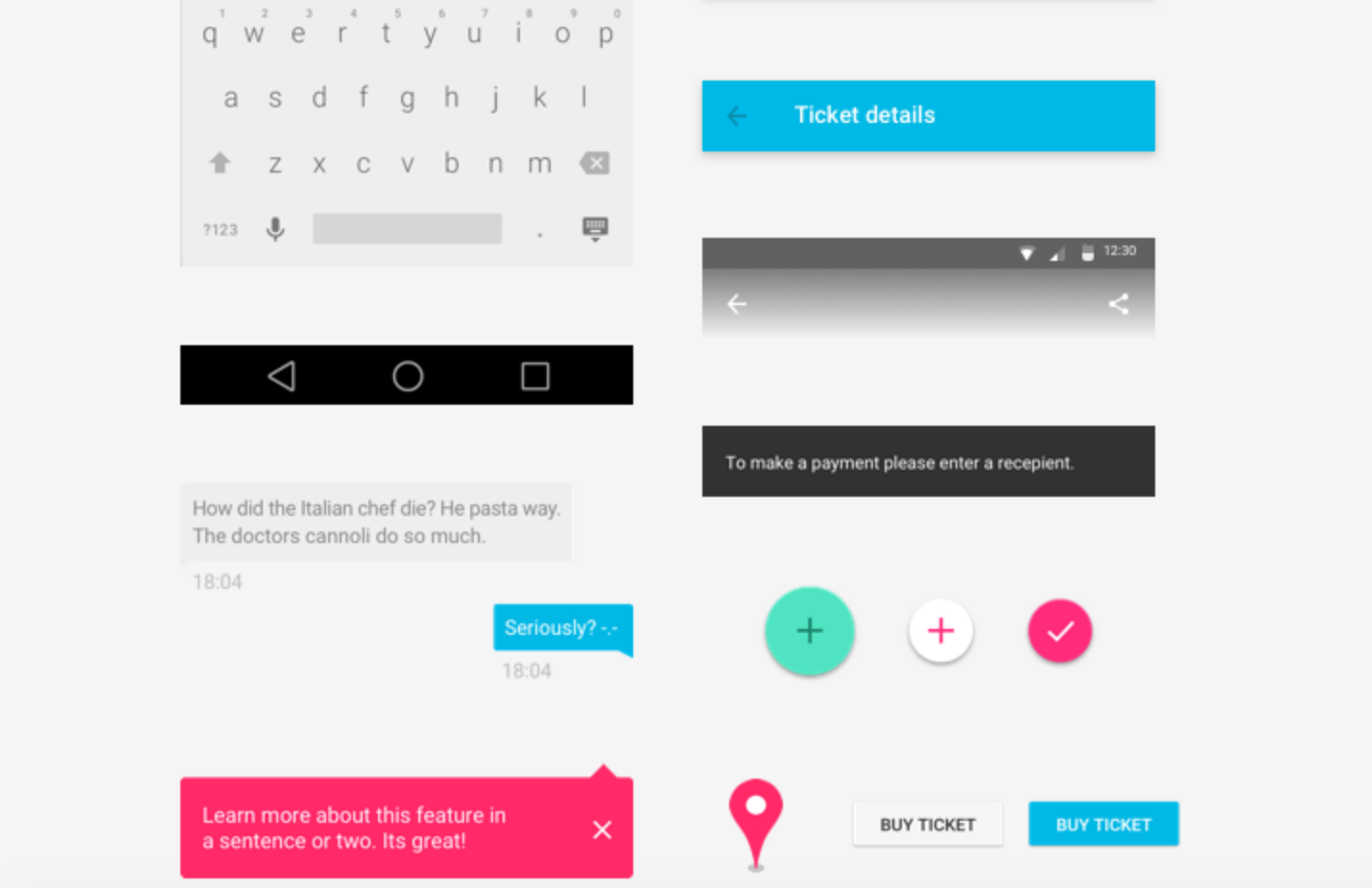
If you work on Material Design project, you’ll need icons that fit your project and follow Google’s icons guidelines:
- Material icons by Google
- Material Design 732 Icons
- Material Line Icons
- Materialup icons
- Material design Icons set
COLORS
Color in material design is inspired by bold hues juxtaposed with muted environments, deep shadows, and bright highlights. Color should be unexpected and vibrant. Watch this video by google about color palette.
- Google material colors
- Material Colors
- Material Palette
- Material Colors
- Material UI
- Material UI colors
KITS
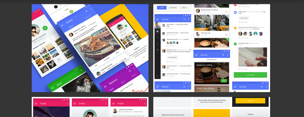
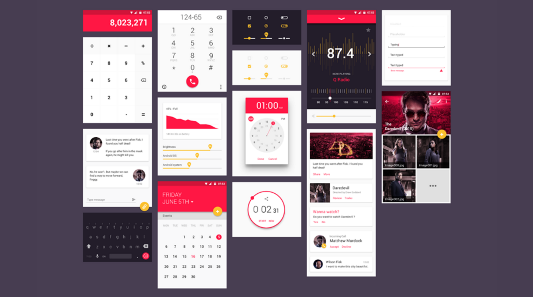
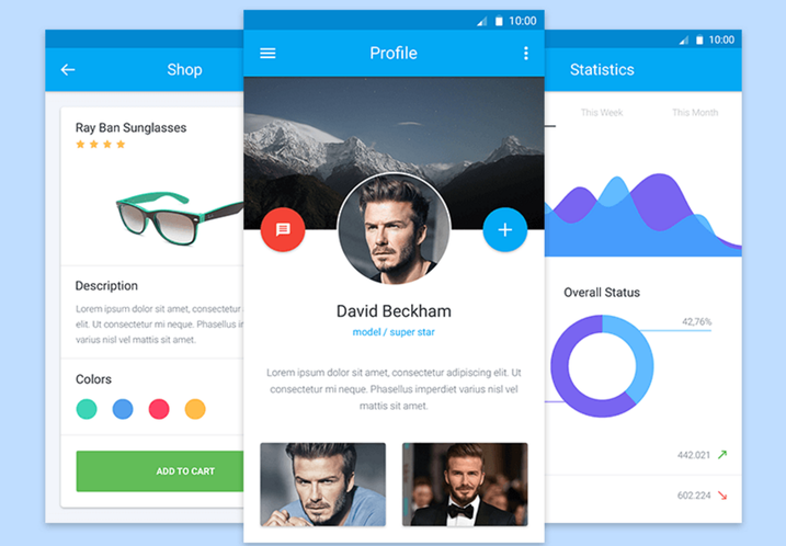
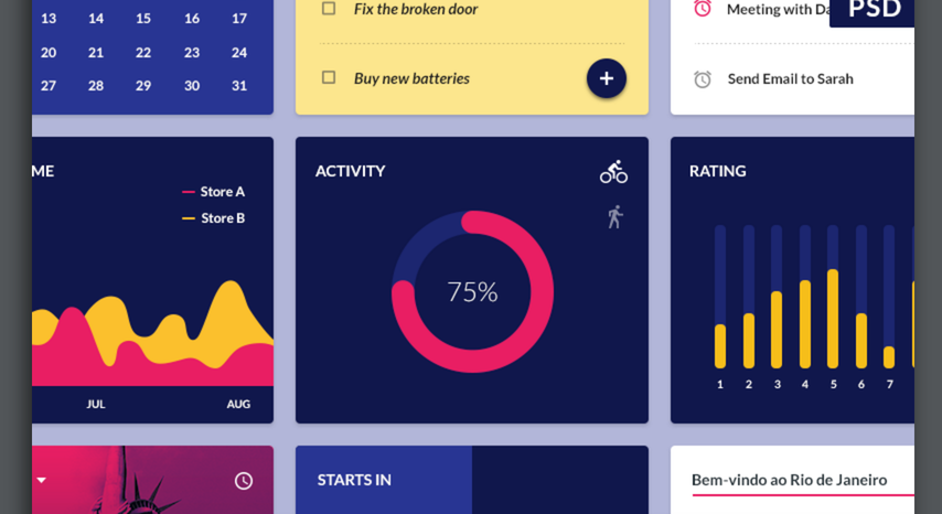
We did a selection of trendy material design UI kits that may fit your project.
THEMES
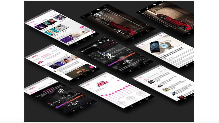
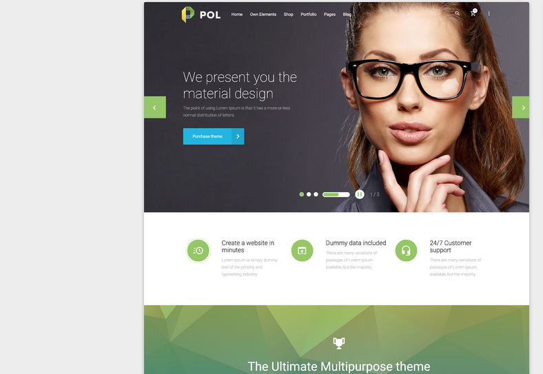
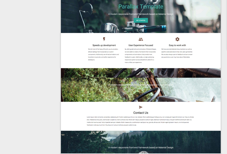
Selection of latest cool themes for your different projects
MATERIAL DESIGN AWESOME EXAMPLES
Author
-
Ekaterina Novoseltseva is an experienced CMO and Board Director. Professor in prestigious Business Schools in Barcelona. Teaching about digital business design. Right now Ekaterina is a CMO at Apiumhub - software development hub based in Barcelona and organiser of Global Software Architecture Summit. Ekaterina is proud of having done software projects for companies like Tous, Inditex, Mango, Etnia, Adidas and many others. Ekaterina was taking active part in the Apiumhub office opening in Paseo de Gracia and in helping companies like Bitpanda open their tech hubs in Barcelona.
View all posts
