Table of Contents
Typography trends emerge every year, you can clearly see it on Dribbble, Behance, Pinterest, Instagram, UX designers portfolio, corporate webpages of leading companies, etc. Everyone is becoming aware of the importance of typography in UX design. Much more than just arranging pretty fonts on a nice background, typography is an essential part of every design, it can make or break a whole project. It enhances your story, emotions you want to drive. It helps you to communicate the message to your clients.
Typography trends are influenced by culture and media, past and present, technology and fashion, but the ones who really make a difference are big players. This wouldn’t necessitate any revolution in the typography world, except that Amazon, Apple, and even Google have continued their habit of innovation by introducing their own custom typefaces as an attempt get the most out of the transforming technological scene. For example, Amazon’s most significant contribution is the typeface, Bookerly, made just for Kindle. Google’s new custom typeface is Product Sans, and for Apple it’s the San Francisco typeface, which debuted with the Apple Watch. Typography is the art of designing letters that communicates a feeling and determines the effectiveness of UX design.
Typography helps to create an experience for the reader or user before they even click on a button. It goes beyond choosing a weight and size for some letters, typography involves many components such as the selection of the point size, stroke length, spacing, etc.
Communication plays a vital role in UX design. Whether you design websites, mobile apps, or wearable UIs, your creations have to clearly communicate their intent and purpose. Therefore, you need a solid understanding of typography and why this year we have certain typography trends. Oliver Reichenstein states in his essay, “Web Design is 95% Typography”.
Optimizing typography is improving readability, accessibility, usability, overall graphic balance. In this article I want to discuss with you Typography trends of this year. Reading this article you will hopefully get inspired and find out typography trends that make websites win awards. It’s also important that you don’t jump into typography trends too far. You really need to analyze internal and external factors to choose the right one for you, also think about long term strategy. Typography is something that you can’t change very frequently. Don’t forget about keeping your personal identity.
14 TYPOGRAPHY TRENDS IN 2017
1.SCRIPTS
This trend is going to be here in the years to come. Scripts are one of those traditional typefaces that have appeared in a variety of trendy initiatives.
2. WATERCOLOR
Watercolor is another style that can bring life to your web page. Watercolor typeface gives the impression of a fun-loving and friendly attitude, so it is great when you want to emphasize a down-to-earth and personal approach behind the brand or product. Watercolor styles are appealing because they feel handcrafted, making the design appear special and unique.
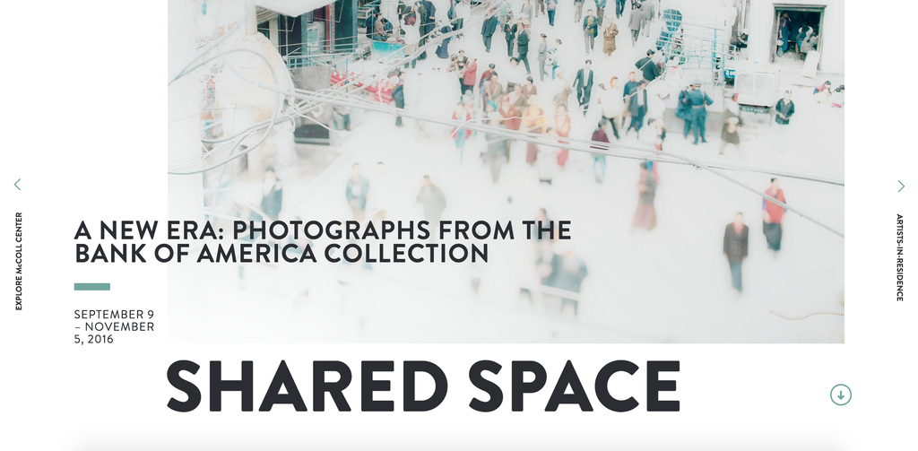
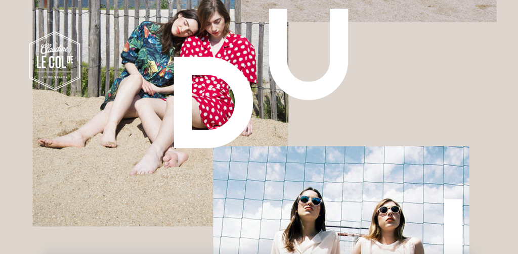
3. BIG & BOLD
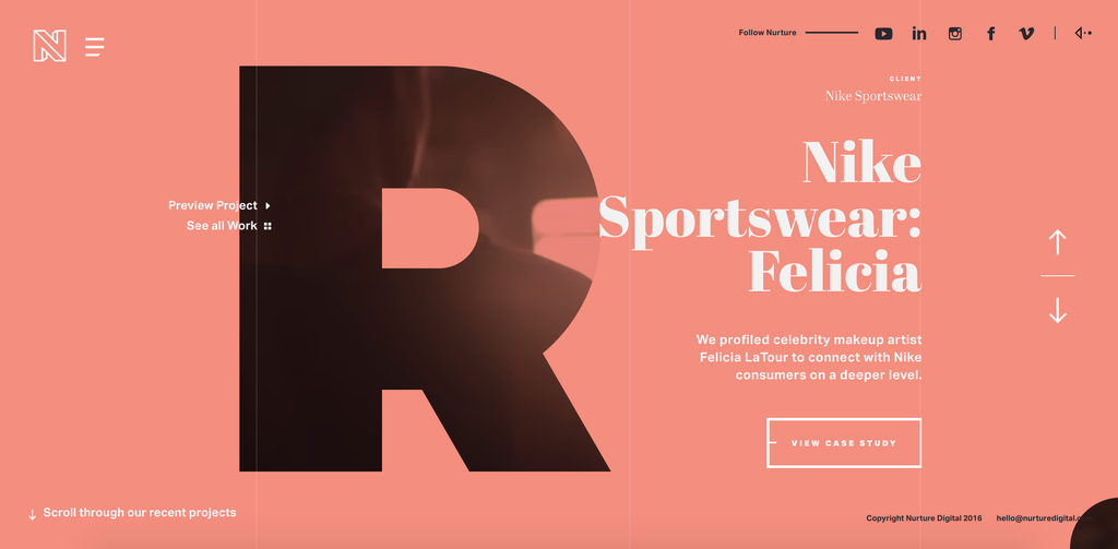
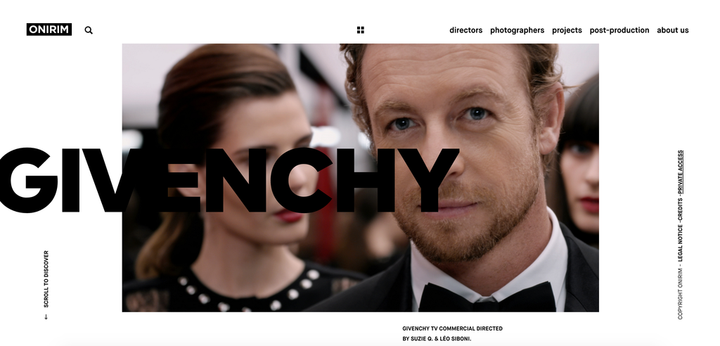
Big & bold typography makes a message powerful. With this trend, you could see a single word that fills an entire screen and you just loved it. There were days when all typography had to be tiny and you needed to explain your brand with words. Not anymore. Now you can say everything just by choosing the right typography and color. No more essays needed. Typography can say a lot about you; whether you are elegant or hippy, your are serious or funny, feminine or masculine, etc. With big & bold typography UX designers usually use big full-screen images. And when done well they can look splendid. An example could be Hudson; good choice if you want to follow this trend.
4. HAND – DRAWN TYPEFACE
Hand-drawn typeface is on the rise as a powerful option. Some are really hand-drawn and some a stock fonts modified to look hand-drawn. Either way, they add a personal touch. It is unique as it is capable of communicating a messaging about the organization behind it. You won’t see too many hand-drawn fonts in the corporate world, but you will see them a lot in service industries. Again, authenticity is a big must for most brands these days and one of the effective ways to offer that authentic vibe is use a hand-crafted type. The nature of handmade lettering connects with most customers, because people love nature, so it’s worth trying it. Typefaces like Reusk, could be an excellent starting point.
5. PHOTO OVERLAYS
This is the one you see on social media every day, usually on inspirational memes involving a quote over some nature scene. As a web design technique, photo overlays became also very popular. Here it is extremely important to understand that you are dealing with a photo background, that means that you should keep text minimalistic.
6. GEOMETRIC DESIGN
Geometric fonts are themselves on the rise, you can read an article about it here. Take Jova’s approach as an example of how cool geometric type can be in the right context.
7. SERIFS
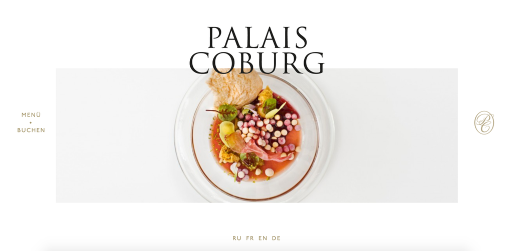
It’s a typical example of one of those back to basics trends, and it works because serif fonts are elegant, readable, and clean.
8. SLAB SERIFS
A specific type of serif, the slab serif, is also gaining popularity. Due to high resolution capabilities, slab serifs can achieve boldness without being overly bold, conveying practicality, stability, reliability. Slab serif can act as a solid foundation for a landing page.
9. CREATIVE USE OF THE SIMPLE
Sometimes creativity is all you need when you play with typography. A lot of designers have taken the most basic fonts and made them memorable and creative, it’s just a matter of combining things together, make it consistent and personalized, showing your brand identity. And yes, people love simplicity.
10. RETRO
Retro design style is one of the hottest trends this year in which various fonts are mixed. It has been always common in every art to look to the past for inspiration to use some elements and put them in the modern world. It gives the feeling of an interesting combination of nostalgia and futurism at the same time.
11. MIXED AND MATCHED
Mixed type means just a mix of types. Let’s say a minimum of three. This doesn’t just mean a variation on a single font, but a carefully matched set of very different fonts that go well together and give a consistent overall visual effect. Balance is key to this approach, when done right it can be very effective and modern and unusual. In this case UX designers normally pay attention to textures, patterns and artwork that are going to be part of the web design.
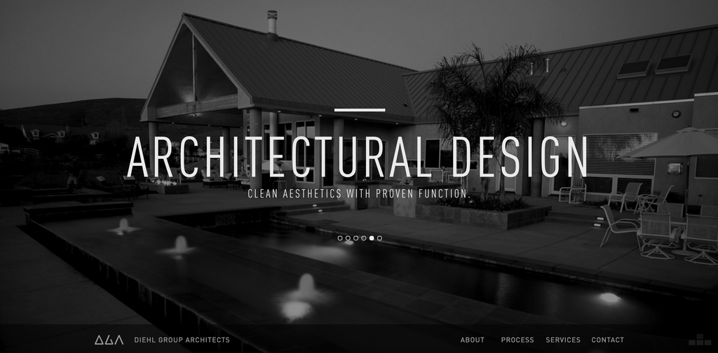
12. ALL CAPS
If you want your message to stand out from the crowd and if you want to make it loud and clear, all caps is the right choice. Here don’t over use it, otherwise your users will thinks that’s too much.
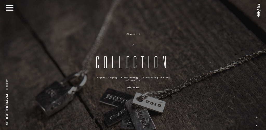
13. THIN AND MINIMALIST
With this minimalism movement and love to simplicity in general, thin and clean typeface is always a good option. For example, Naive Line Sans is one of these typefaces that you can use in your minimalist web design project.
14. 80s
The 80s is that time that never goes out of fashion. People have a lot of memories, a lot of emotions and lot of happy moments associated with these years. Its cool and Imogen Agnes is my favourite one if I think about this type of typography.
BEST EXAMPLES OF TYPOGRAPHY IN WEB DESIGN THIS YEAR
I hope this article was useful for you, if you find it interesting, subscribe to our monthly newsletters and receive our top articles!
Author
-
Ekaterina Novoseltseva is an experienced CMO and Board Director. Professor in prestigious Business Schools in Barcelona. Teaching about digital business design. Right now Ekaterina is a CMO at Apiumhub - software development hub based in Barcelona and organiser of Global Software Architecture Summit. Ekaterina is proud of having done software projects for companies like Tous, Inditex, Mango, Etnia, Adidas and many others. Ekaterina was taking active part in the Apiumhub office opening in Paseo de Gracia and in helping companies like Bitpanda open their tech hubs in Barcelona.
View all posts
