Table of Contents
If you have read my article about typography trends in modern web design and you are a beginner in UX design, probably you had a lot of questions, therefore I decided to write an article explaining the basics in Typography world. This article is basically a beginner’s guide to typography and here you will find key typography tips to create awesome designs.
First of all, what you need to know is that effective design and good typography go hand in hand. I really liked the quote of Oliver Reichenstein: “A great designer knows how to work with text not just as content, he treats text as a user interface”.
Typography separates the professional designers from the newbies. Working with typography means maximizing readability, accessibility, graphic balance and usability. Don’t underestimate the importance of typography in UX design, typography helps to communicate our ideas and purpose to our users, it creates balance, hierarchy and structure, what leads to better absorption of the content.
Typography has its own language, full of serifs, strokes, and ascenders. You can find a very good visual explanation here: Canva’s article.
And here is a guide to fundamental typography terms together with some great typography tips and best practices from our team of UX designers:
29 Typography tips
-
TYPEFACE VS FONTS
Let’s start with the basics, a typeface is a collection of fonts, and a font is a style within that family. For example, Lato is a typeface and Lato Light Italic is a font.
-
SERIFS & SANS SERIFS
Although serifs are considered to be decorative, serif typefaces have historically been known for readability. The increase the reading speed of long passages of text because they help the eye travel across a line, especially if lines are long.
As for the sans serif, it works well for a more liberal design approach as well as short texts.
-
GLYPHS
For those who doesn’t know what are Glyphs, Glyphs are the characters and symbols in a typeface, such as asterisk for example.
Use glyphs as design elements and choose a typeface that shows off its unique design, design that goes together with your idea, with your brand.
-
TRACKING
Play with the text, play with letter spacing for better readability. The less crowded your letters are, the better and cleaner the interface design is.
-
LEADING
This is about the lines of text. Play with the space, find the balance, again the less crowded it is the better. Better reduce the content rather than putting the whole text, trying to fit it on a certain tiny place. The spacing between lines really affects legibility, they shouldn’t be too tight or too loose, find the perfect space taking into account your other design factors.
-
HANGING PUNCTUATION
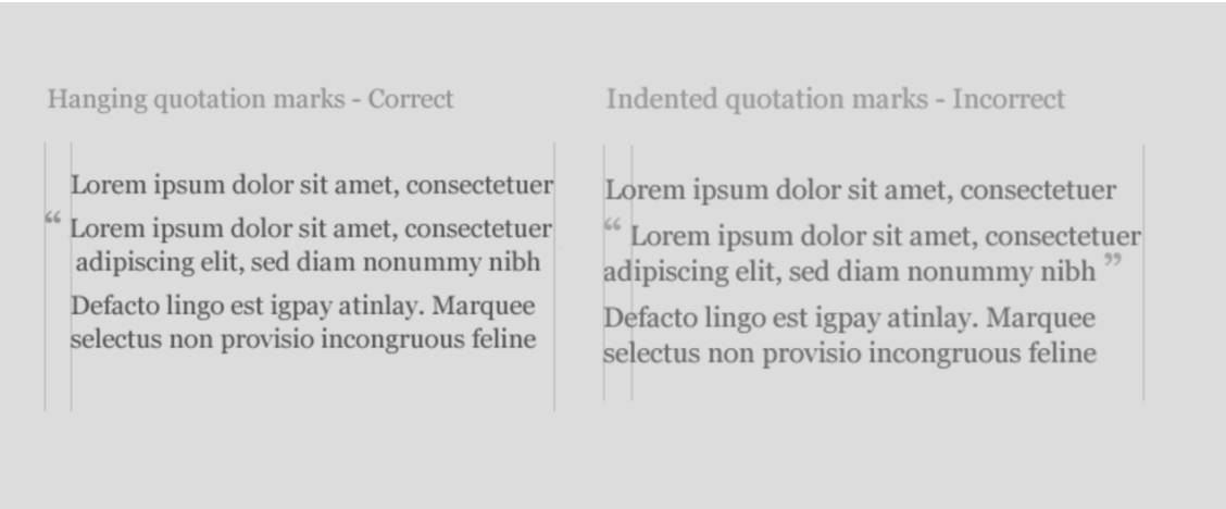
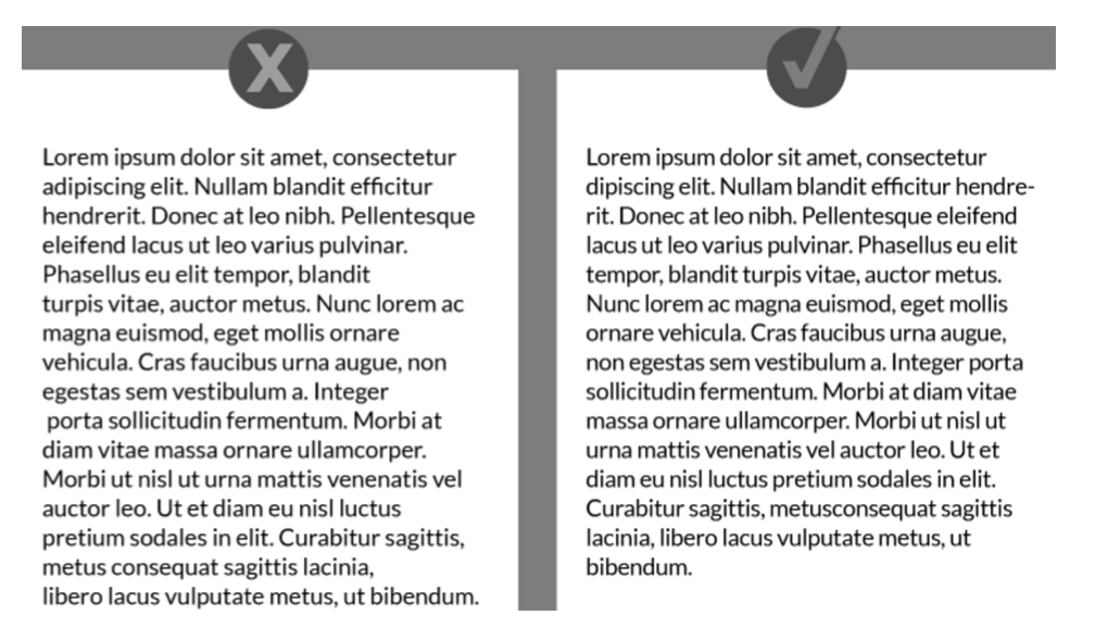
As you can see from the incorrect option, there is a break in the flow of the text as well as visual design. This destroys the text alignment aesthetically since our eyes constantly search for straight lines. Take it into account for your next project, people like organization, people like consistency.
-
LEGIBILITY
You may be working on a creative design, but don’t forget about the most important thing – legibility! For example, thin, white text on a brown background might look elegant, but can be hard to read. Legibility is a combination of many factors, for example font could be too small, the font and background colors might not have enough contrast, transparency effects might make text hard to read and many many more. Traditionally, serif fonts are used for body text, because it helps the eye move along more quickly. But simple, sans-serif typefaces can work well as well, experiment, try, test!
-
ORPHANS & WIDOWS
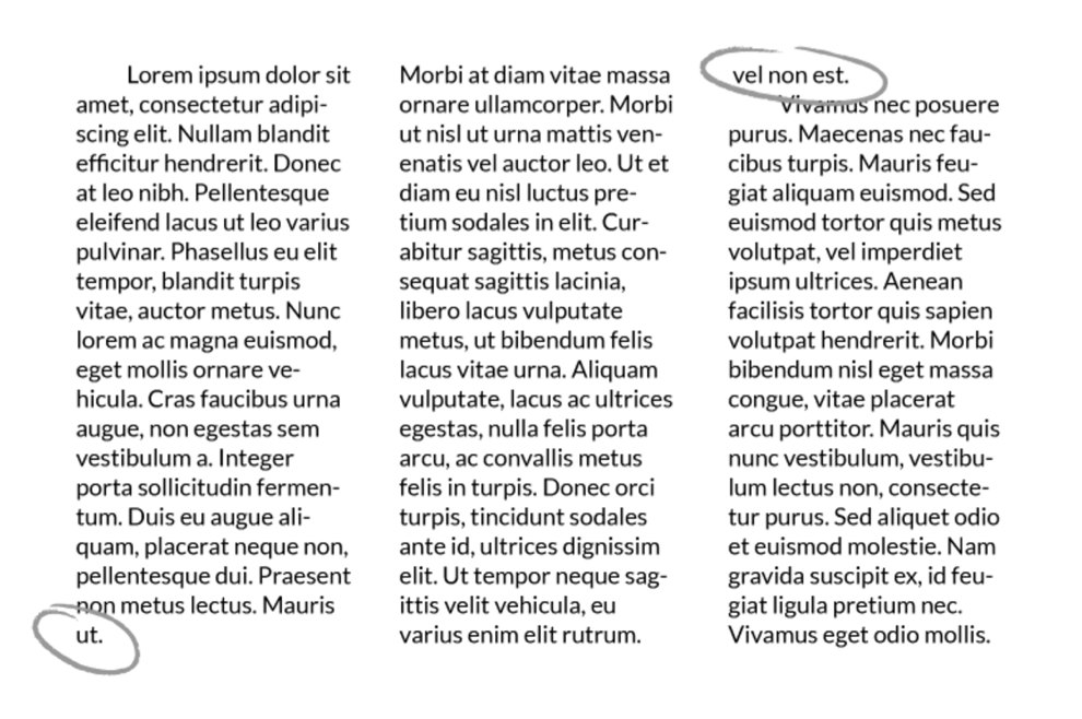
Speaking about body text, one of the easy-to-overlook errors that can happen when working with paragraphs of text are orphans and widows. These are the words or short lines that appear by themselves at the top or bottom of a column or page of text, separated from the rest of the text. Don’t leave them like this, they create white space that interrupt the text and aesthetically speaking it’s just not nice. It’s actually very easy to fix: just manually change where the line breaks, or adjust line length or tracking slightly.
-
PROPORTIONAL SCALING
Another very frequent mistake is stretching or condensing words to fit into a certain space. Don’t do this, it distorts the letters, giving them a shape they weren’t supposed to have.
Even if you’re scaling a text box up or down, do it proportionally. Different design programs have various shortcuts for doing this. For example In Adobe programs like Photoshop and Illustrator, you hold down the Shift key as you drag the corner of your text box and you get the balanced result. Other than that you can adjust the font size or do the tracking to fill a space more effectively.
-
SIZE & LENGTH OF THE LINE
The optimal size and length of the line are the following: for desktop, 50-75 characters per line at 16 pt font or higher is a good rule of thumb for body text. As for mobile, good rule of thumb is to use 30-40 characters per line.
-
DOUBLE SPACING
Don’t double space between sentences. This practice is now considered outdated and unnecessary. Double spacing creates visual breaks in a block of text that interrupt readers’ flow.
-
SCALABILITY
Typefaces should be selected taking into account how they will perform across all different sizes. Many typefaces look great and are easily readable on larger sizes, but typefaces with very thin letters may be hardly readable on some devices.
-
RECOGNIZABLE FONTS
Actually many typefaces look creative but have problems with readability. Sometimes you can’t really understand whether the letter is I or L. Letters should be distinguishable. You should make it easy for the users to read your content, don’t make their life even more complicated than it is right now.
-
OPTIMAL NUMBER OF TYPEFACES
Some designs require a decorative mix of typefaces, but most of the projects don’t. The majority of design projects benefit from a limited number of fonts, two or three is a good rule of thumb. Too many types and styles of fonts can make your design look unprofessional. Sticking to a more conservative approach to typography keeps your design looking clean and organized instead of cluttered and chaotic.
What is important to understand here is that you need to give each font a specific role in your project to create an effective design.
-
FONTS MATCH
Part of making good typography choices is picking fonts that harmonize well. Choosing one serif font and one sans-serif font is a good starting point. Follow UX influencers on Twitter, Dribbble, Behance etc and look how they pair fonts effectively.
Don’t forget that choosing complementary fonts is as important as the main one. Because at the end combination of all of them will create the design. Many fonts have distinct moods and personalities; serious, casual, playful, elegant, etc. What is extremely important here is to make sure the moods of your font choices match the purpose of your design. For example, a rounded, bubbly typeface may be appropriate for a daughter’s birthday party invitation, but not for your corporate newsletter.
To create good combination of fonts, let’s say if you have a strong personality, pair it with something more neutral and conservative for a balanced design.
Picture source: designshack
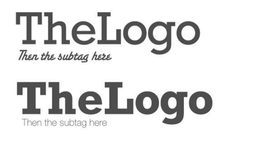
If we analyze the first picture, the types of fonts chosen are very poor. The supporting font is more ornate and harder to read than the primary font, also it detracts from the primary font and should be avoided. Another problem of these fonts that they are simply too similar in thickness to be used together. Even though they are different in style, their similar stroke weight doesn’t provide enough visual contrast between the two.
As for the second image, these fonts are properly contrasted: the subheadline is thinner, the emphasis is on the headline – primary font and that was the objective.
Avoid pairing fonts that are too similar. Typefaces that are somewhat different but have comparable weights, proportions, letter shapes, etc. still make your design look confusing. By the way, using typefaces from the same family is always a safe bet; after all, they were created to work together. Look for families that come with a range of options; different weights, styles, etc. to ensure that you have enough variation for your purposes.
When pairing fonts that come from the same family, you have to plan carefully to create contrast.
-
VISUAL HIERARCHY
Choosing fonts, you need to think about headlines, sub-headlines, etc. To create a visual hierarchy, you need to play with sizes, boldness, spacing, etc. all that contribute to how the eye navigates the page and what text attracts attention first. Normally the most important textual element is generally the largest and the weightiest.
-
CONTRAST
One of the main reasons why pairing serif and sans-serif fonts works so well is that it creates contrast. This idea of contrast brings together multiple concepts that you should be considering, including hierarchy and how fonts complement each other creating balance and makes it easy to read and understand the idea. Contrast can be achieved in many ways, for example through style, size, weight, spacing, color, etc.
-
STEER CLEAR
When combining fonts, you do want contrast, but you don’t want conflict. Just because fonts are different doesn’t mean they will automatically work well together. Generally speaking, typefaces that share a couple qualities, for example they have similar proportions, or the lowercase letters have the same height – are more likely to look harmonious together, even if the overall appearance differs.

Picture source: designschool
-
CONTEXT CONSIDERATION
Part of the process is actually deciding what kind of typefaces are more appropriate for your design, for example neutral fonts or crazy ones, etc. Sometimes you may need something that really pops, and other times the context will require a font that is more classy.
For example here you can see a clear contradiction between the meaning and the visual representation; typography is not representing the text, the idea in this case.
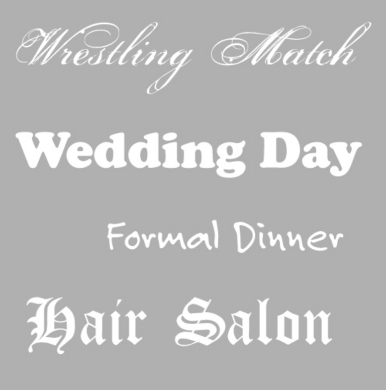
In order to avoid visual disconnection, if you you talk about games, then use a playful font, etc.
Every font communicates certain attributes on both a conscious and subconscious level. Two of the major areas of communication are gender and era. Consider the examples below:
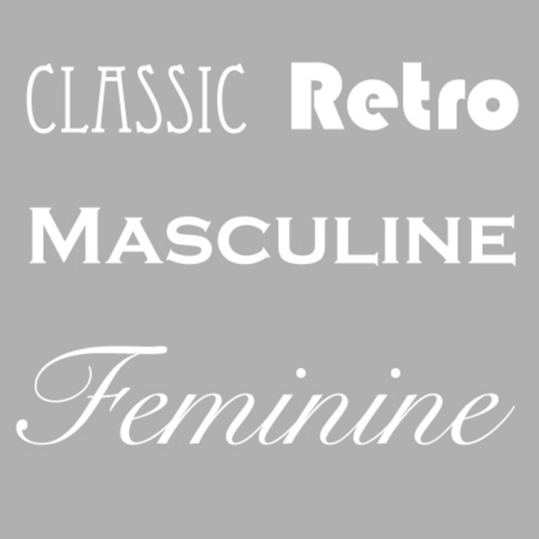
Picture source: Designshack
-
FUNCTION
Typography can be very artistic, creative and unique, but it also needs to be functional. Again, don’t forget about readability, purposes of your project and balance.
-
EMPHASIS
Don’t use bold, italics, caps, etc in one passage of text; it looks like you’re trying too hard to get your message across and feels messy rather than meaningful. Balance it, structure it, the occasion should be rare that you even need more than one.
-
ALL CAPS
One form of emphasis is capital letters. Writing in all caps is all over the place. If you feel you must use this technique, please do it purposefully, for example for the headlines. Don’t use capital letters for the body text, it may look heavy and may seem like you are yelling. Apply all-caps for short headings, because as a matter of habit, the human eye is more accustomed to reading lowercase text. Therefore, all-caps should be used sparingly and are best suited for short headings or sub-headings to catch the attention of the reader.
-
ALIGNMENT
Consistency is one of the most important things when aligning text. Make sure all your text is arranged in an orderly, logical way. You don’t want some paragraphs left-aligned, some center, and some right. And you should generally avoid justified alignment altogether. Justified alignment almost always creates irregular spacing and random chunks of white space that look weird and make reading difficult.
One of the easiest ways to make sure your alignment is on point is to turn on the margins and guides in whatever design program you’re using. While this step won’t fix every alignment problem, it will give you a solid start for laying out your design in an organized way. Many programs also have special alignment tools that do most of the hard work for you, for example, selecting multiple objects and aligning them to a certain point on the page.
Even if you’re careful with your alignment, sometimes you might end up with paragraphs that have ragged edges. Rags are visually distracting and destroy uniform appearance. The best way to fix them is just going through and changing where the lines break manually. It takes a little extra time, but it’s worth it to give your text relatively straight edges and a clean appearance overall.
-
SPECIAL EFFECTS
Nowadays avoid using special effects on your text; 3D, shadows, gradients etc. It was left in 20th century, now it is considered to be outdated and cheap, so the simpler the better.
-
FINAL CHECK
This is more a practical consideration than strictly design-related, but an important one. Doing a final read-through of your text, checking for spelling and grammar errors should always be a part of your design process. Unfortunately, even small errors can make your project look unprofessional and possibly give your audience a negative perception of your message or company. Always double check your project.
-
FEEDBACK
Design isn’t just for designers; it’s for users. Once you’ve made your decisions, test them out to make sure users like and understand your design. A good rule of thumb: If users have to ask, it’s probably not working. There are plenty of user testing tools, which you can find here.
-
PRACTICE
Practice combining fonts on your own, using best practices and taking into account the check list that we have discussed. Come up with new ideas. As with any skill, becoming competent involves a lot of trial-and-error. So take risks, experiment, use your intuition, learn from the experiences designers.
-
INSPIRATION
Several months ago I have written an article about inspiration resources, use them! There you will find projects that you like, they may inspire you to create something really nice. And of course, there are plenty of tools, which can tell you what the fonts are used in the project you like. One of them is fontspring.
-
COLLECTION
If you don’t already have a folder of “design inspiration” or “ projects I like” or something like this, start one now. Keeping a diverse collection of inspiring examples you like gives you a broader palette to base your decisions on. It’s not important that you know why or when you’ll use a particular typeface, but it may give you ideas, it may teach you, it may show you the current trends, etc
If you are interested in UX design, I recommend you to subscribe to our monthly newsletter and receive exclusive info about upcoming events, trends, news and best practices.
Author
-
Ekaterina Novoseltseva is an experienced CMO and Board Director. Professor in prestigious Business Schools in Barcelona. Teaching about digital business design. Right now Ekaterina is a CMO at Apiumhub - software development hub based in Barcelona and organiser of Global Software Architecture Summit. Ekaterina is proud of having done software projects for companies like Tous, Inditex, Mango, Etnia, Adidas and many others. Ekaterina was taking active part in the Apiumhub office opening in Paseo de Gracia and in helping companies like Bitpanda open their tech hubs in Barcelona.
View all posts


One Comment
Nickole
Great post! Thank you!