Table of Contents
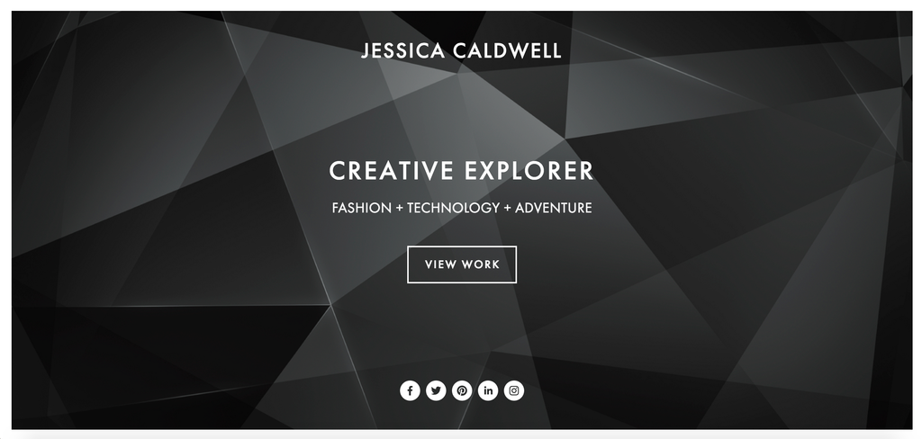
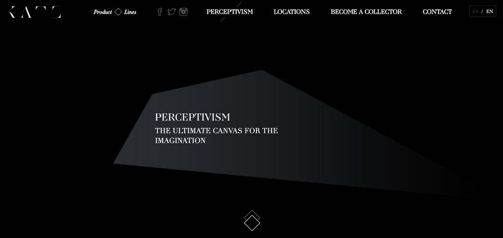
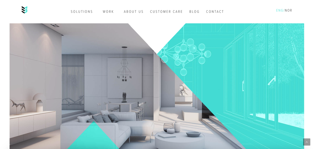
The geometric web design trend continues in 2017.
A well-designed and well-thought website can help to drive potential customers and generate greater returns and profits along with an enhanced business value and geometric shapes help to set the mood, help to communicate what you want to say to your users. Later in the article we will discuss the meaning of geometric shapes and how it’s better to use them to achieve your goals.
There are plenty of designing elements that can be integrated in geometric web design to transform a usual thing into a piece of art. Geometric patterns when used correctly can be visually pleasing & effective and of course very functional; making your customers to look where they are supposed to look. You can use them to bring vibrancy and life to your designs or a softer elegance to reinforce your brand proposition.
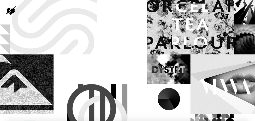
Geometric shapes when integrated creatively can help develop a simple and impressive website design. There are a lot of geometric shapes that can be used while designing a website including circles, squares, hexagons, triangles, and many more to highlight the website content, draw attention on some specific details, improve the entire look and feel of the website, make it look unique, creative and beautiful.
Geometric shapes can be applied in different situations: as individual graphic elements, as backgrounds, as an illustrative technique. Mostly UX designers use them as a framing component, navigation elements, or for highlighting call to action buttons.
These days, when most UX designers strive for clearness and simplicity, geometric web design is an excellent way to create something unique and different, add modern and innovative look, maintaining clean interface.
GEOMETRIC SHAPES: MEANING & USAGE
Shapes have their own special usage and meaning. They can be eye-catching for the visitor and provoke certain emotions and actions. With their help, you can redirect the visitor’s attention to particular places on a page, focusing on the most important areas of the content. Shapes help UX designers to enhance the message they want to deliver, they set the mood.
-
SQUARES & RECTANGLES
Rectangular shapes represent stability. They are both familiar and reliable, giving the impression of honesty, formality, and rationality. They are by far the most common geometric pattern.
-
CIRCLES
The circle is essentially infinite. They suggest a comprehensive quality or fullness. Often the represent femininity, harmony, love, and perfection. They are warm, giving energy, power, safety and connection.
-
TRIANGLES
Triangles are one of the strongest geometric shapes in designs, they are ideal for drawing the viewer’s attention and creating a powerful impact on the website visual appeal. They are used to indicate action and aggression.
Also, what was observed is that rather than implementing triangles as a separate shape, triangles are often implemented along with other geometric shapes, like circles, squares, etc to create a complicated and a stylish geometric figure.
-
RHOMBUS
The Rhombus is a diamond shape, defined by diagonal lines. They can be used to make a design look and feel more vibrant, active, and contemporary in nature.
-
HEXAGONS
Hexagons are six-sided shapes which communicate unity, strength, and balance. Often associated with honeycombs, suggesting cooperation between individuals, hexagons have become a common trend among tech business websites.
6 TIPS: HOW TO USE GEOMETRIC SHAPES IN WEB DESIGN
1.BALANCE
Geometric patterns is a great way to grab a lot of attention, but if you’re planning on using or combining a lot of them, consider balancing them out with some less-busy elements. And don’t forget about white space, which helps to put an emphasis on the elements you want your target to be focused on.
2. MIX AND MATCH ELEMENTS
Mix and match shapes, patterns and colors. It will help you create really dynamic and beautiful compositions.
3. PHOTOGRAPHY & GEOMETRY
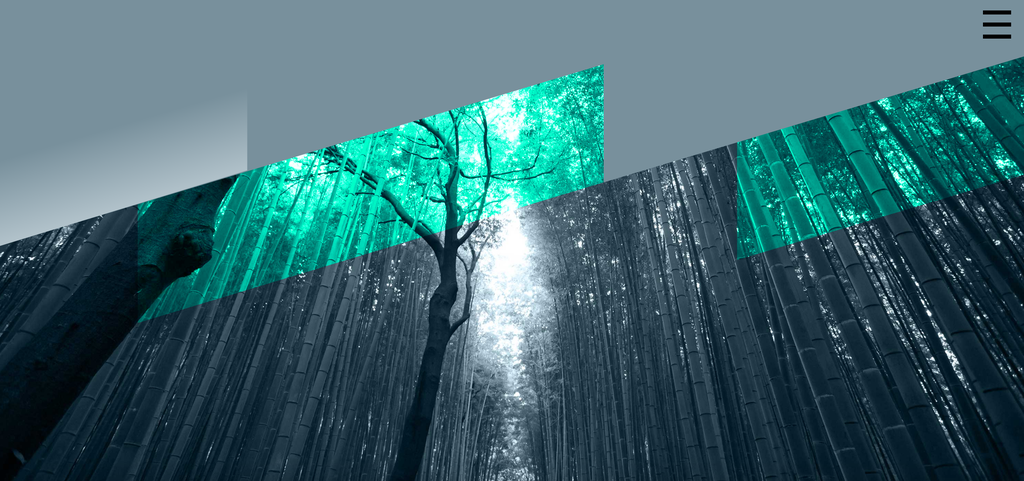
Strong shapes + strong photographs = strong designs. Mixing your photographs with intriguing geometric patterns and shapes can boost their contrast and give them a unique, mysterious look.
4. MEANING
The best designs are the ones with meaning and thought behind them. Don’t just create a mix of geometric shapes with no story behind. Everything you do should reinforce your message, your brand proposition.
5. EMBRACE FOILING
Metallic foil can give your geometric pattern some added class and sophistication. It shows elegancy and status.
6. GO MINIMAL
Everybody likes minimal and simple design. I think a minimal design is harder than colorful design, its difficult to stay minimal while having interesting and creative design. Minimal designs can pair very well with geometric patterns as they often act to balance each other out.
5 GEOMETRIC WEB DESIGN EXAMPLES
Author
-
Ekaterina Novoseltseva is an experienced CMO and Board Director. Professor in prestigious Business Schools in Barcelona. Teaching about digital business design. Right now Ekaterina is a CMO at Apiumhub - software development hub based in Barcelona and organiser of Global Software Architecture Summit. Ekaterina is proud of having done software projects for companies like Tous, Inditex, Mango, Etnia, Adidas and many others. Ekaterina was taking active part in the Apiumhub office opening in Paseo de Gracia and in helping companies like Bitpanda open their tech hubs in Barcelona.
View all posts
