Table of Contents
Several months ago I have written an article about photography in web design and I got really inspired to write one about the golden ratio in web design as it is as important for UX design as for photography.
UX design requires creativity and well-thought-tested ideas, sometimes even perfection and natural balance. If you want to be on the same wave as Leonardo Da Vinci, Salvador Dali, and other extraordinary creative and genius people, you need to know what all of them have in common: the usage of the golden ratio in their designs. And today we will look at why and how to use the golden ratio in web design to achieve a beautifully balanced interface and make people enjoy their experience with your product.
To be honest it all comes from the Ancient Greeks, who were one of the first ones to discover a beautiful asymmetry found in nature: trees, flowers, animals, people, etc. They expressed this phenomenon with the Greek letter phi, but today, we call it the golden ratio. Since that time artists and architects have used a strong understanding of proportions and the essence of the golden ratio to create aesthetically pleasing architecture and pieces of art. Even now we consider beautiful people to have golden ratio proportions and we form this opinion unconsciously; the location of eyebrows, nose, mouth, eyes, etc.
Now like many years ago, the golden ratio is used to determine the format of credit cards, books, furniture, interior design, decoration of the plates in restaurants, etc. You see it in Twitter’s dashboard, in the Pyramids of Giza, in Da Vinci’s Mona Lisa, and in the logo of Google, Pepsi, Twitter, Apple, etc. It’s literally everywhere you look. We were grown with a golden ratio, most of the masterpieces that we studied at school had this golden ratio proportion. Sometimes we don’t really know why we choose a certain option over another one, but in most cases, if we start measuring the proportion, we will see that golden ratio designs are the preferred ones.
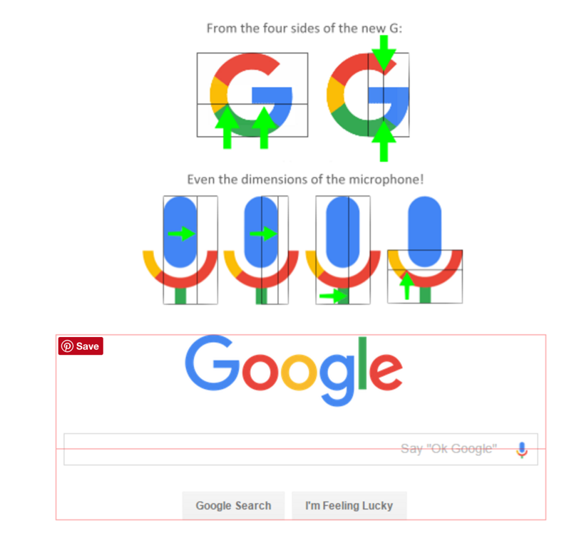
Source of the picture: Golden number
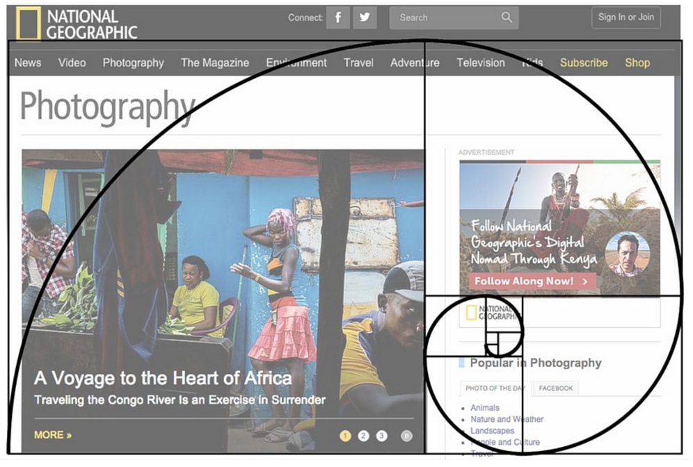
The same happens with UX design. Web pages have a more classical and balanced appearance when UX designers use the golden ratio in web design. These designs just look right and unconsciously they are pleasing to the users. Images, blocks of text, sidebars, buttons, etc can all be nicely placed in golden rectangles that form a “perfect” design. Visitors feel comfortable interacting with the website because the proportions are familiar to them from many works of art, classical buildings, and nature.
Remember my article about neuroscience in web design? There we talked about the importance of familiarity, the unconscious mind, and how we can influence it. By using the golden ratio in web design, you become appealing to your viewers, and unconsciously the layout of the website looks perfect for them as well as familiar. That makes them much more likely to read and view your website in depth. Golden Ratio in web design is also used to balance content that is text heavy, create hierarchy and draw users’ eyes to specific areas. This is one of the triggers you can use if you want to use neuroscience in your works and play with different parts of the brain.
Math and science are beautiful. They help us discover unknown things and better understand ourselves & our target. As we discussed before most aesthetically pleasing designs have math in common. Let’s see more in detail what is the golden ratio in web design and what are the numbers behind it.
GOLDEN RATIO IN WEB DESIGN: MATH & BEAUTY
The golden ratio is known for the proportions 1:1.618. Of course, the mathematical equation at work is much more complicated than that, but this is the base for the creation.
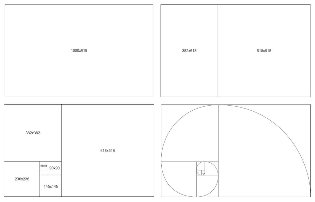
Just to give you an example, let’s look at a rectangle with golden proportions:
Source of the picture: Company folders
We take the width of 1000 pixels and divide it by 1.618 to get a height of about 618 pixels.
Then we add a 618 x 618 square on the right side of the canvas, leaving behind a 382 x 618 rectangle on the left side – another golden rectangle, etc! As you could get, a “Golden Rectangle” is a rectangle whose length is 1.6180 times its width.
The golden rectangle is the most used shape to visualize the golden ratio, but you can also use circles and triangles in a very similar way.

Source of the picture: Company folders
For instance, as you can see in the picture you can create an approximate golden spiral shape out of circles and those circles fit perfectly inside a system of golden rectangles. It is again aesthetically appealing look and tends to achieve visual harmony.
A lot of designers use it, and a lot of designers don’t. It’s up to you, normally if a person likes numbers, math, and perfection, he uses the golden ratio to be 100% sure the design is well thought out and calculated.
Now let’s see how the golden ratio can be used in other design elements:
-
TYPOGRAPHY
If you want to use the golden ratio, it is important to implement it in your typographical graphic design elements as well. For example, let’s say that you’re using 10pt font for the body text. Using the golden ratio, you can determine the best size for the headings by multiplying the body text number by 1.618. So, in our case, it will be 10*1.618 = 16.18, which you can round down to 16pt font. The combination of 10 and 16 looks really nice and at the same time it is good for UX design as you can clearly see from the headline, sometimes math does some work for you!
-
IMAGES
It’s all about how you crop the photos and how you size them. When you crop pictures with the golden ratio in mind, you might also consider using the golden spiral as a guide for the shot’s composition.
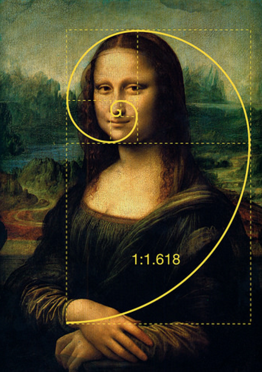
Source of the picture: hongkiat
For example, you could crop a photo to golden proportions in such a way that the main focal point of the image is at the center of the corresponding golden spiral.
-
LOGO
You can also use the golden ratio in branding. Even if the logo itself isn’t shaped like a golden rectangle or triangle, it can still employ elements that use golden proportions.
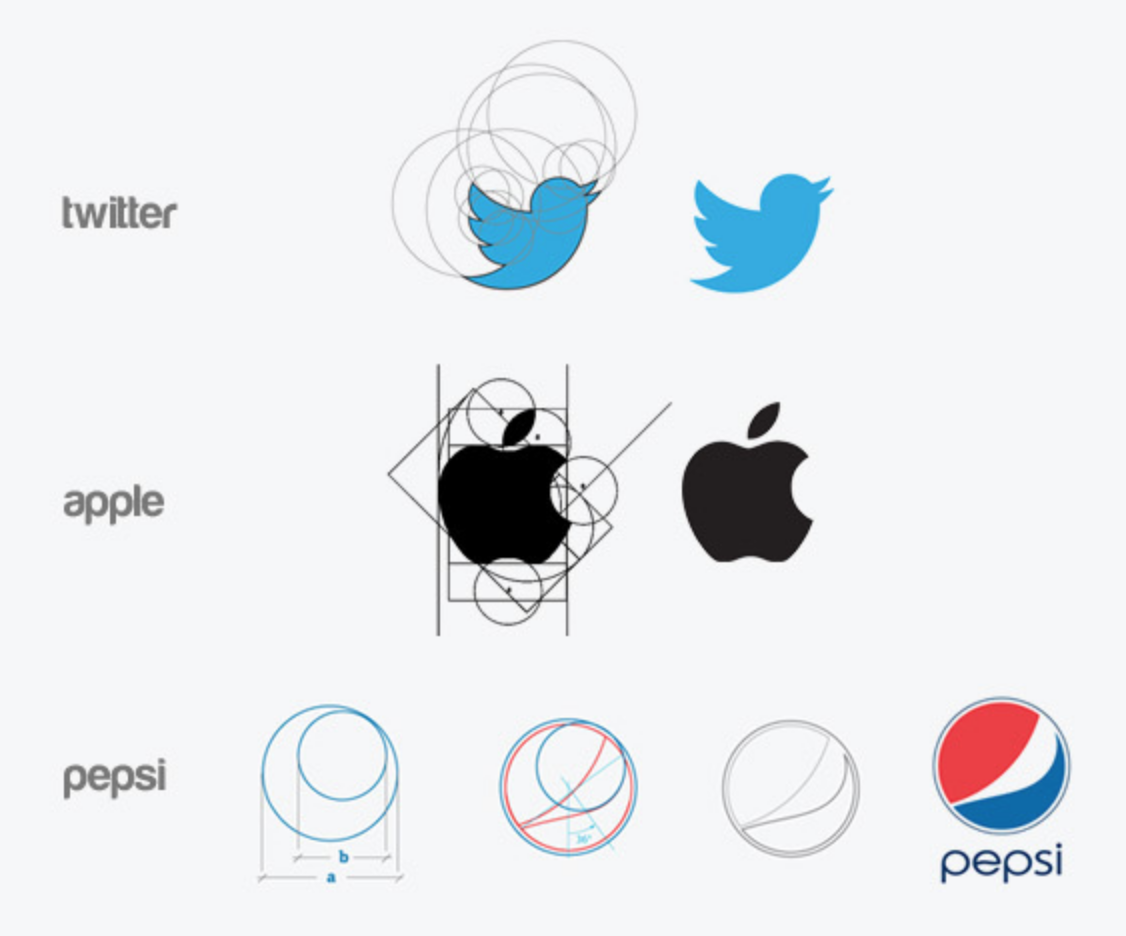
Source of the picture: Behance
-
LAYOUT
The golden ratio is also used to divide space between the body of the website and the sidebar. The principle is the same, body is 1.618 times larger than the sidebar.
Let’s say you want to find the width of your Main Content and Sidebar columns. You would take the total width of your content area, for example, 900px and divide it by 1.62, the result is 555.55px. It is not necessary to be that accurate, so you can actually round it to 555px. Now you know your main content element will be 555px wide and your sidebar will be 345px.
GOLDEN RATIO IN WEB DESIGN: TOOLS
- Phi Calculator – a great tool to know golden ratio dimensions. You just need to enter any number into this tool and it will give you the result you need for the golden ratio. It’s free and very easy to use.
- UX triggers – awesome tool to test any website according to golden ratio perfection. This tool quickly identifies whether or not the design follows the golden ratio rule.
- Goldenratio app – a very cool app that provides an easy way to design websites, interfaces, layouts, etc. according to the golden ratio.
- Phimatrix – an amazing tool for customizable grids and templates. It allows you to upload any image and analyze it in terms of the golden ratio principle and design your idea in seconds.
- Golden section finder – a pocket-sized viewfinder to observe the golden ratio basically everywhere you want.
If you are interested in UX design, I recommend you subscribe to our monthly newsletter and receive exclusive info about upcoming events, trends, news, and best practices.
Author
-
Ekaterina Novoseltseva is an experienced CMO and Board Director. Professor in prestigious Business Schools in Barcelona. Teaching about digital business design. Right now Ekaterina is a CMO at Apiumhub - software development hub based in Barcelona and organiser of Global Software Architecture Summit. Ekaterina is proud of having done software projects for companies like Tous, Inditex, Mango, Etnia, Adidas and many others. Ekaterina was taking active part in the Apiumhub office opening in Paseo de Gracia and in helping companies like Bitpanda open their tech hubs in Barcelona.
View all posts





One Comment
Arezki
this website was very helpful thank you very much 🙂