Table of Contents
When this boom of smartphones and mobile apps began, when technology started to dominate our lives, skeuomorphic design was the best option for that time, why?
ERA OF SKEUOMORPHIC DESIGN
Skeuomorphic design is intuitive by relating tasks and representation to real world objects. Skeuomorphic design makes it simple for users to understand the interface and act without any difficulties. Designs are intuitive when they feel familiar. And this design trend is all about that, it reduces the learnability of an interface and make the interaction with the brand simple and engaging.
Skeuomorphic design is perfect especially for the older generation, which is not that advanced with new technology evolution. It harnesses these familiarities of real world to improve the user experience, so that the patterns you learnt in the real world are mirrored in the interface.
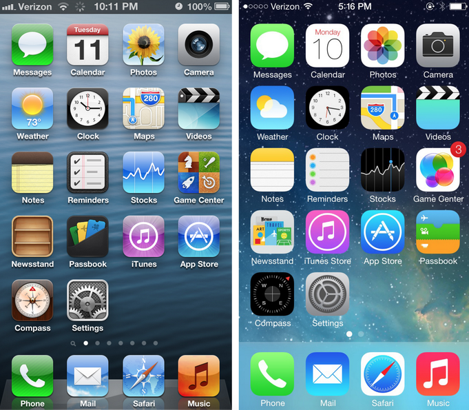
Remember apple interface before IOS 7? Me, personally, I loved it!
Absolutely amazing ibooks, where you could see the cover page of the book, shelves, you felt like you are in the library. For books lovers, it was a good substitute, because the digital page effect was very close to the one in real life! Calendar, contacts, notes app, everything was intuitive and easy to use. Do you remember the textures of these apps? Leather, fabric and paper were recreated using colour, shadow, highlight, bevel and gradient. You could feel that you use a physical object, same feeling but much more convenient; instead of having 10 kg in your bag; full of books, note books, contacts book, etc, you could have their look and feel in your smartphone or PC.

The key benefit of using skeuomorphism in design is simple transition between real life objects and their digital counterparts. It is kind of a guide in the digital world. Beginners will always understand realism in design more quickly than minimalism.
Let’s take an example of a DJ app. In skeuomorphic design DJ clearly sees the turntable and the knobs and instinctively knows how to use the app, because visually it looks almost like the real one.
Also, it is an excellent option for the difficult products and industries. It can make the functionality and overall theme of the web or app very clear, explaining the process and product in an easier way. For example, three-dimensional animation is still the preferred design standard for explaining technical products or complicated scientific concepts, because it places it more in the real world.
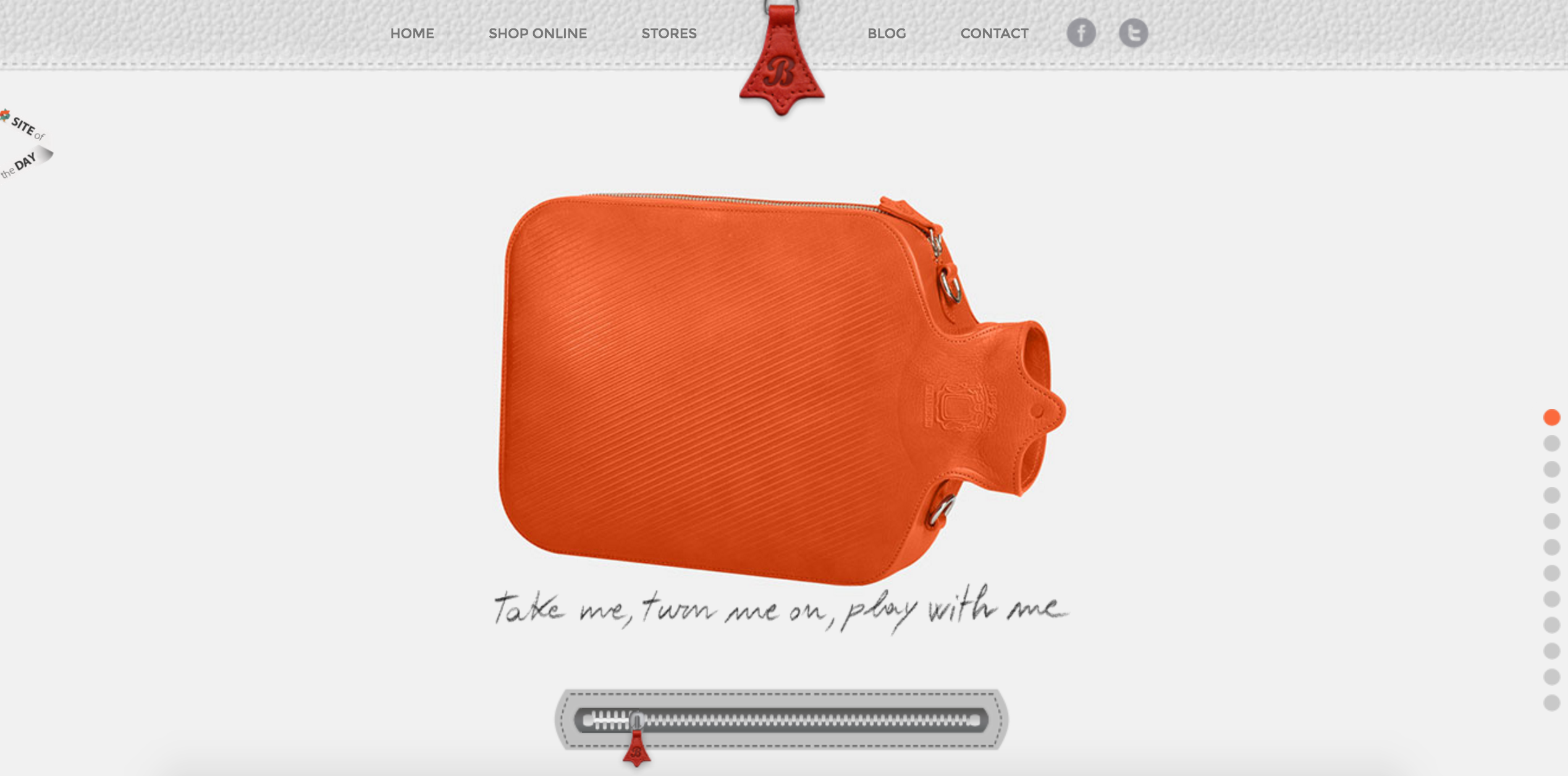
In user experience design, digital skeuomorphism has a great potential for bringing rich emotional experiences to digital devices, which are otherwise impersonal. We spend most of our time with computer or smartphones and have a real life touch drives more emotions than just animated image. Most of the book lovers will admit that flip-through pages are much more nicer than just cold flat interface of the book. Or fashion lovers, I am sure that most of them will say that they would choose skeuomorphic design to have this look and feel of the brand even in small details, like for example leather.
Skeuomorphic design means making visuals and images look like a realistic imitation of real life objects, by using shadows, gradients, bevels and 3D-effects. Arguments against skeuomorphic design include that it takes up more screen space on digital devices and loads quite slow.
Every trend sooner or later is changed by a new one and skeuomorphic design was substituted by a flat design, which is focused on simplicity and which in a way solved the problem of loading times and responsiveness. This movement has started around 3 years ago, but some brands like Instagram changed their skeuomorphic design only this may and still a lot of instagram fans like more their skeuomorphic design logo. There will be always people who will like or hate your design or a particular trend, but always take into account your target, your business goals and your model. Don’t go for a flat design just because all companies go for it, have your personality, deliver your value to your customers! Do what is better for you and your users!
Apple decided to go for a flat design because in their strategy skeuomorphic design played an educational role, Apple introduced its products in a very simple and easy way for the users. When customers started to feel confident about Apple products, Apple moved forward and decided to go for simplicity and resource efficiency.
SHIFT TOWARDS FLAT DESIGN

The shift towards flat design came when users started to need and want something new. It was reflected in the users’ attitudes towards technology, for example:
Familiarity: users got used to technology and didn’t need a direction anymore. They already have understood of how digital interfaces should work.
Innovation: new applications always try to be modern and faster than old ones. Skeuomorphic interfaces use a lot of image files or processes to create, with bevels, textures, and shadows. Flat design allows interfaces to load more quickly and smoothly than skeuomorphic design.
Responsiveness: with m-commerce growth and boom of smartphones, companies started to notice that it is not very easy to browse on the mobile phones and find information or buy a product.
Minimalism: with overwhelmed websites and mobile apps, people started to be tied of all information there is on the websites with tons of useless elements.
According to some successful business cases, flat design may increase conversion rates by 261 percent, and flat buttons in particular may increase click-through rates by 35.81 percent.
Many marketers argue that designers should use buttons with drop-shadows and gradients, so that they stand out more, especially when it comes to calls to action. But according to the statistics of last years, button design comes down to contrast, not shadows and gradients and contrast plays a key role in conversion rate.
However, flat design also has its small defects which cause poor usability issues and dissatisfaction of the users. For example, with flat design you remove all clues and you end up with a flat world where every element is placed at the same level, what actually leads to confusion. Sometimes, flat design can be unclear on what’s clickable and what’s not. Flat design is very different from what people are used to. With flat design it became in my opinion too simple and to execute it well became quite hard.
Also this design trend became a hated one for some users and many designers because they find it very boring and impersonal. Therefore designers started to think how flat design can be improved and what users need nowadays, this lead to new designs and new techniques, in 2016 it became quite hard to find 100% flat design, normally companies started to implement new trends into their flat projects.
WHAT’S NEXT ?
Many of the flat or almost flat sites hitting the web today include photos, something very few early flat sites had.
Now, designers don’t use flat design as an all-or-nothing practice. They use individual components that can be used as part of their greater system.
Nowadays, ux designers swing back towards functionality. A lot of leading ux designers and product owners call this era – “post-flat” design era, which is about incorporation the mentality of flat design and the functionality of skeuomorphism that worked so well for users in the past. Also, designers started to use material design for their projects to achieve simplicity, easy of use and functionality.
Post flat design is not just a new way of thinking about design aesthetic, but it is about creating sensible visual hierarchy and more understandable interfaces for the users.
What do you think? What will be the next design trend?
Author
-
Ekaterina Novoseltseva is an experienced CMO and Board Director. Professor in prestigious Business Schools in Barcelona. Teaching about digital business design. Right now Ekaterina is a CMO at Apiumhub - software development hub based in Barcelona and organiser of Global Software Architecture Summit. Ekaterina is proud of having done software projects for companies like Tous, Inditex, Mango, Etnia, Adidas and many others. Ekaterina was taking active part in the Apiumhub office opening in Paseo de Gracia and in helping companies like Bitpanda open their tech hubs in Barcelona.
View all posts


