Table of Contents
Everyone has favorite colors that they usually use for their interior design, for clothes, etc. In a way color represents a person and can say a lot about his or her character and preferences. As for the UX design, skilled UX designers should forget about their color tastes and focus on evaluating business goals, color meanings and their impact on purchasing behavior. Color combination should represent a brand without any text, the final goal of the designer is that customers could describe the company just looking at the color combination the company uses for its website or a mobile app.
Before starting the process, designers should do some UX research to know better their target and then test their design, their choice of colors. A/B testing helps a lot when the research is related to color influence on conversion rate. It will help designers to determine which color combination and placements generate the most leads and traffic.
The perfect color combination is very powerful because it can influence the mood and emotions of the customers. People mostly buy because of the emotions factor, not because of the product or service itself. Successful brands, like for example Harley Davidson don’t sell just motorcycles, they sell a lifestyle and their color combination supports it.
Also, color is an essential tool because it has an impact on how we think and behave. Color directs our customer’s eye where to look, what to do, and how to interpret something. It puts content into context. It helps our customers see what is the most important and navigate easier. The interaction with the brand becomes much more fun and interesting.
Nowadays, people are overwhelmed with many things in their daily life and therefore everything is moving towards simplicity, people like simplicity! Make interaction with your brand more simple and at the same time interesting! Clear message, clear structure, clear interface!
COLOR THEORY
Color theory is a complex subject that analyzes how different hues, tins,etc interact with one another. Color theory is a science.
According to Canva, The Colourlovers community has indexed nearly 8 million user-named colors, while there are over 16 million possible hexadecimal color combination.
Studying how colors affect different people is something people build their careers on. Something very simple like changing the exact hue or saturation of a color can evoke a completely different feeling. Color in design is very subjective. What evokes one reaction in one person may evoke a very different one in other people. Sometimes this is due to personal preference and cultural background.
Just to stay on the same page, let’s look at some theory that would be a solid basis for your design projects.
CHEAT SHEET WITH COLOR TERMINOLOGY
- Hue – object’s color, pure color. Synonymous to color, all of the primary and secondary colors, for example, are hues.
- Chroma – purity of a color. A hue with high chroma has no black, white or gray in it. Adding white, black or gray reduces its chroma. Chroma could be seen a brightness of a color in comparison to white.
- Saturation – how a hue appears under particular lighting conditions. Think of saturation in terms of weak vs. strong.
- Value – could also be called as lightness. It refers to how light or dark a color is. Lighter colors have higher values. For example, yellow has a higher value than navy green or dark blue. White has the highest value of any hue and black the lowest.
- Tones – when grey is added to a hue. Tones are generally softer-looking than pure hues.
Tones with more grey may create a vintage style. - A shade – when black is added to a hue, making it darker.
- A tint – when white is added to a hue, lightening it. Very light tints are sometimes called pastels.
COLOR SYSTEMS: RGB VS CMYK
If you have ever played with colors on any computer program, or on power point presentation, you’ve probably seen a module that listed RGB or CMYK colors with some numbers next to the letters.

CMYK FOR PRINTING
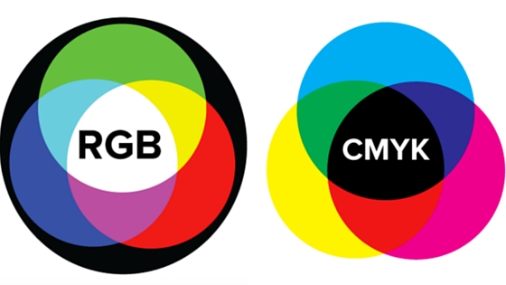
CMYK stands for Cyan, Magenta, Yellow, Key (Black). These are the colors that are listed on your ink cartridges for your printer.
CMYK is the subtractive color model. It’s called like this because you have to subtract colors to get to white.
Let’s look at it with corresponding numbers. CMYK works on a scale of 0 to 100. If C=100, M=100, Y=100, and K=100, you end up with a black color. But, if all four colors equal 0, you end up with true white.
RGB FOR SCREENS
RGB stands for Red, Green, Blue, and is based on the additive color model of light waves. This means, the more color you add, the closer you get towards white.
Let’s look at it with corresponding numbers, RGB works on a scale of 0 to 255. So, black would be R=0, G=0, and B=0. White would be R=255, G=255, and B=255.
Due to these differences, designers need a way to get consistent color results when working with both systems, for example, if you’re designing a logo to use on your website but also want to get a business card printed with the same logo, you have the Pantone Matching System (or PMS) to solve this problem. Colors can be matched for web and print to ensure a uniform appearance. The Pantone system makes it easy for designers, clients, and printers to collaborate and ensure that the final product looks as needed.
COLOR COMBINATION, COLOR HARMONIES

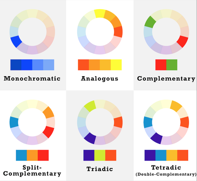
Picture is taken from Canva design school
- Monochromatic palette uses shade or tint variations of the same hue
- Analogous palettes use colors that are close to each other on the color wheel. These palettes typically create a feeling of consistency and uniformity within design. Analogous combinations do not create themes with high contrasting colors, so they’re typically used to create a softer, design
- Complementary palettes are created with colors that are opposite to each other on the wheel. Normally shades and tints are used to avoid a harsh contrast that can create eyestrain when two opposing colors are placed next to each other
- Split – complementary palette uses one hue together with two others equally spaced from its complement
- Triadic palettes consists of three main colors equally spaced on the wheel, if you draw an equilateral triangle from a color you chose, you will see 3 diverse colors to work with. They are normally softened with tints and shades
- Double – complementary palettes – two complementary color sets, the distance between selected complementary pairs will affect the overall contrast of the final composition. The best way to use double complementary is to do a color combination by using one color as the primary color in a design and the others just as accents. Don’t forget about chroma, value and saturation when creating these kinds of color schemes
3 TERMS THAT DEFINE THE BASIC COLOR THEORY
- Complementation is the way we see colors in terms of their relationships with other colors. When colors are opposite to each other they make people consider a design visually appealing by establishing a balancing medium.
- Vibrancy sets the emotion of your design. Brighter colors lead the user to feel more energetic, they are commonly used for emotional response as well as CTA buttons. Bright colors lead to action. Darker shades relax the users, allowing them to focus on other more important things.
- Contrast reduces eyestrain and focuses user attention by clearly dividing elements on a page.
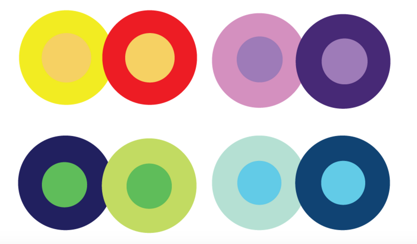
If you are doubting which colors to use, the best practice is usually to choose a very light color for the background, and a very dark color for the text itself. Using a variety of contrasting colors can help focus the viewer’s attention on specific page elements as well, of example if you put the “ subscribe” button in orange and the background color is light grey, it will immediately catch the attention of the user .

As you can see in the picture, the middle of each of the circles is the same size, shape, and color. The only thing that changes is the background color. As you can see, the middle circles appear softer or brighter depending on the contrasting color combination behind it.
COLOR MEANING – AND WHAT IT MEANS FOR DESIGN
While color combination can be appealing to us visually, a lot more is going on behind the scenes than just an aesthetic. A lot of researches has been done on how colors influence us psychologically and what association people have looking at particular ones. Knowing the power of color psychology can help you make better decisions to meet your goals:
RED
It is a very hot and powerful color. Red can have a physical effect on people, raising blood pressure, respiration and heart rates. It creates urgency and mostly used for impulsive buyers. It also enhances human metabolism and encourages appetite.
Red can be associated with anger, danger, but is also associated with importance. In Eastern world this color is associated with prosperity and luck.
In branding, red often communicates strength, confidence, and power and is a highly visible color, among all colors it catches the most attention of the people.
ORANGE
It is a very vibrant and energetic color. Orange represents change and movement.
Because orange is associated with the fruit of the same name, it also associates with health and vitality. In design, orange commands attention without being as overpowering as red. It’s often considered more friendly and inviting, and less in-your-face.
It communicates activity, energy, and optimism.
In branding: Orange often represents youthfulness and creativity.
YELLOW
It’s associated with happiness, friendliness and sunshine.
In some Eastern and Asian cultures, yellow is associated with royalty or high rank. In some parts of Africa and Latin America, yellow is the traditional color of mourning.
In branding: yellow is used to catch attention, but it always should be used in contrast.
GREEN
It represents new beginnings and growth. Green can also represent jealousy and a lack of experience.
In design, green can have a balancing and harmonizing effect, and it is very stable.
Normally, It is used for designs related to wealth, stability, renewal, health and nature.
In branding: brands that wants to be considered as “green” in the sense of natural, healthy, sustainable, environmentally friendly, organic, etc often use nature-inspired colors like green and brown.
BLUE
Is often associated with sadness. Blue is also used to represent calmness and responsibility.
Light blues can be refreshing and friendly. Dark blues are more strong and reliable.
Blue is also associated with peace, and has spiritual and religious connotations in many cultures and traditions.
In branding: It’s generally used to communicate trustworthiness, security, and stability. Blue is a favourite color of men, brands use it when their primary target is men.
PURPLE
It is associated with creativity, romance, anti-aging, femininity and imagination. In many countries it is associated with royalty.
But, in Thailand, purple is the color of mourning.
In branding: Purple is used when the primary target is women.
BLACK
Is the strongest of the neutral colors. On the positive side, it’s commonly associated with power, elegance, luxury and formality. On the negative side, it can be associated with evil, death, and mystery. Black is the traditional color of mourning in many Western countries.
Black is commonly used in elegant designs. It can be either conservative or modern, depending on the colors it’s combined with.
In design, black is commonly used for typography and other functional parts, because of it’s neutrality.
In some Asian and Latin American cultures, black is considered a masculine color. Also, in some countries it is associated with bad luck.
In branding: Colors always look brighter and more intense against black. Black is one of the favorite colors of men, it is used a lot in a daily life of men and women and black is used if the goal is to show formality, conservatism and elegance.
WHITE
White is often associated with purity and cleanliness.
It’s also associated with the healthcare industry and wedding.
In design, white is generally considered a neutral backdrop that lets other colors in a design have a larger voice. It can help to achieve cleanliness and simplicity, it is popular in minimalist designs.
In China, white is the color of mourning.
In branding: white is often used to communicate simplicity. Designers who work on minimalism design, frequently use a lot of white.
GREY
Very often it is considered as a depressing color, it is associated with old age and bad mood. Also, it is considered to be a formal color, which is commonly used for corporate purposes. Light greys can be used in place of white in some designs, and dark greys can be used in place of black.
Grey is generally conservative and formal, but can also be modern.
In branding: it is commonly used in corporate designs it communicate formality and professionalism.
BROWN
It is associated with the earth, wood and chocolate.
In design, brown is commonly used as a background color. It’s also seen in wood and stone design.
In branding: it is used mostly when it comes to the desserts and furniture topics.
I hope this theory was helpful for you. My next articles will be about tools, tips, inspiration, trends and statistics regarding color combination. I will show you successful case studies that will hopefully inspire you to create something awesome that would also have a positive impact on conversions.
Don’t miss it and subscribe to our monthly newsletters!
Author
-
Ekaterina Novoseltseva is an experienced CMO and Board Director. Professor in prestigious Business Schools in Barcelona. Teaching about digital business design. Right now Ekaterina is a CMO at Apiumhub - software development hub based in Barcelona and organiser of Global Software Architecture Summit. Ekaterina is proud of having done software projects for companies like Tous, Inditex, Mango, Etnia, Adidas and many others. Ekaterina was taking active part in the Apiumhub office opening in Paseo de Gracia and in helping companies like Bitpanda open their tech hubs in Barcelona.
View all posts


