Table of Contents
Color can grab attention, set a mood, and even influence our emotions, perceptions and actions. But sometimes it can be hard to know where to start when choosing a color palette for your design project. Therefore, our UX designers listed down some useful tips for you and we added some web design color trends you might found helpful!
11 COLOR TIPS FOR UX DESIGN PROJECTS
1. COLORS SHOULD REFLECT YOUR BRAND
Colors should help you achieve your goals. Do UX research to find all useful information about your users, base your color decision on your strategies and your target preferences. Analyze your competitors and be different! Think about how you want to be positioned in the market and how you want to be perceived by your users: fun or serious, expensive or cheap, etc.
For your inspiration, visit BrandColors, a visual guide with hex codes to the color choices made by leading brands from around the world.
2. USE A COLOR WHEEL
Play with 6 color schemes and find the one that matches your business model the most.
Don’t forget about a very good quote: “All colors are the friends of their neighbors and the lovers of their opposites” – Artist Marc Chagal.
In this case, “Friends” stands for analogous colors: those that are side by side on a 12-part color wheel. They don’t stand out from one another. Analogous colors can create beautiful content, but you need to add a complementary color to get any particular item to stand out.
On the other hand, complementary colors are “Lovers”; directly opposite each other on the wheel. Using complementary colors is the easiest way to get something to stand out. But use them taking into account balance factor, don’t use 50% green and 50% red because neither color wins and it causes distress to the eyes.
3. INCLUDE NEUTRAL COLORS
Have at least one neutral color like cream, brown, grey, black or white. It will help you put more accent on the CTA buttons, for example. By having it, users won’t feel overwhelmed with all the colors you have on your web or app.
4. 60-30-10 BALANCE RULE
Designers frequently use the 60-30-10 rule, which suggests that you choose three different colors and use them in the ratio of 60%, 30% and 10%. Simple way to create a professional color scheme for your brand
Just to give you an example in a daily life, man’s suit: the suit jacket and pants account for 60% of the color in the outfit, the shirt accounts for 30% and the tie offers a small pop of color at 10% creating a balanced appearance. Same happens with the app or web, a choosing the right colors for dominant and accent role is extremely important.
Effectively applying color to a design project has a lot to do with balance. Split your color choices into dominant, secondary and accent colors. Dominant color is the most visible and most frequently used in design, while secondary and accent colors complement and balance out that main color, making key elements visible. Accent color should be brighter than dominant color, it should have high contrast with it and should catch attention of the users. Pay attention to how these colors interact with each other, for example the readability ease when text is involved, how colors make others look when they next to each other, what kind of mood a color combination creates, etc.
5. IF YOU WANT TO WIN, GO RED
Red always drive strong emotions and quick reaction of the users.
Red is associated with dominance and high testosterone in males. A red face usually means an angry person. Recent research has showed that red has a strong effect on the competitors – it makes them lose. Two different studies have looked at the use of red colour shirts and uniforms in sports, and both have found that the people in red win more than the people in blue, for example. The reason is unconsciously people see the person in red as the winner, and act accordingly.
For websites and apps it is a great solutions, because our visual brain cells respond very quickly to this color and red automatically stands out from all the rest. To increase conversion rate, to make people click where you want – red is an excellent choice.
6. CONTRAST IS KEY
If you want users to click something, make it stand out! According to usertesting, If your site or app uses a lot of orange, users probably won’t notice an orange button right away, no matter how well orange buttons performed in another company’s A/B test.
Contrast is not just about complementary colors on the color wheel, it is first of all about giving value to your users and your business. Highlight smaller CTA buttons with brighter colors.
In usertesting study, users were much more likely to click a CTA button that strongly contrasted with the background.
Some color combinations can cause illusions when positioned together, sometimes designers also call it “simultaneous contrast”. It may happen when opposing colors are put in close proximity to each other, text may start to vibrate. It can cause eye strain and fatigue and it may lead to a high bounce rate.
7. BRIGHT IS MEMORABLE
According to usertesting study, 50% of people chose one of the bright sites as the most memorable.
8. TINS
Tints are usually used to create feminine or lighter designs. They are also popular in vintage designs and websites targeted at parents of babies.
9. TEXT AND BACKGROUND
Text may be displayed with different degrees of opacity to show how important certain information is relative to other information. The level of opacity used for text depends on whether your background is darker or lighter.
For dark text on light backgrounds: the most important text has an opacity of 87%.
secondary text, which is lower in the visual hierarchy, has an opacity of 54%,
text hints have an opacity of 38%.
For white text on dark backgrounds: first of all, use opacity instead of grey. Black or white text that is transparent remains legible and vibrant against background color changes. This makes it more flexible than grey text in the same contexts.
10. HOW TO GET INSPIRED
The colour of the world around us is one of the strongest influences on our choices in web or design. Colors from fashion, interior design have a strong influence on web design color trends on UX design.

- Capture inspiration on-the-go
Callie Hegstrom, talented designer behind Make Media, said: “I snap photos of gorgeous color schemes,like flowers, or sunsets, and later sample those colors directly in Photoshop or Illustrator. It’s also a great way to match text or graphics with any photo you’re working with to make sure your work is cohesive.”
Life is beautiful, we can get inspired every minute, even every second, when we eat and we see colorful fruits, when we go out and we see a sunrise, when go to a nice office and we like their interior design, when we go to the flowers shop and we see a nice color combination etc.
You can come up with ideas by your favorite painting, the color of your baby’s eyes, crazy vacation in New York,etc .Go out and explore world, I promise you, you will get inspired sooner than you think.
- Visit inspiration websites
Go to websites like Design seeds and get your daily doze of inspiration! Trendy color palettes for every possible need: from elegant and conservative colors to crazy and colorful ones. Nature, food, interior design, fashion, buildings, cities – all this is used to inspire you!
Colourlovers is another awesome website, where people from around the world create and share colors, palettes and patterns. There, you will find 3.7 million user-created color palettes to inspire your ideas.
Color -collective is also a source of inspiration for many designers.
There are many of them, these are just first 3 that popped up in my mind.
- Borrow ideas from interior design
British designer Elena Genova from MyCreativeLand gave very useful advice: “I do like the interior design rule that is pretty much applicable to web&mobile design too: 60% – dominant color, 30% – secondary color, 10% – accent color. By looking at their balanced color combination, you can come up with awesome ideas for your project.
- Bring in colors from nature
Personally, nature is my favorite source for inspiration. Our eyes are used to admiring natural color schemes. If you take your inspiration from the nature, the color combinations are endless and they always create harmony. Sea, mountains, parks, flowers, animals, fruit, vegetables, all this is a free source of inspiration.
- Look at different historical periods and art movements
For color inspiration, it can be another great technique. You can choose the art period which The palettes below demonstrate the warm, light-filled colors common to impressionist paintings. Vivid and unexpected combinations used by post-Impressionists. Soft, earthy colors characteristic of the Art Nouveau movement and the bright, bold hues of Pop Art.
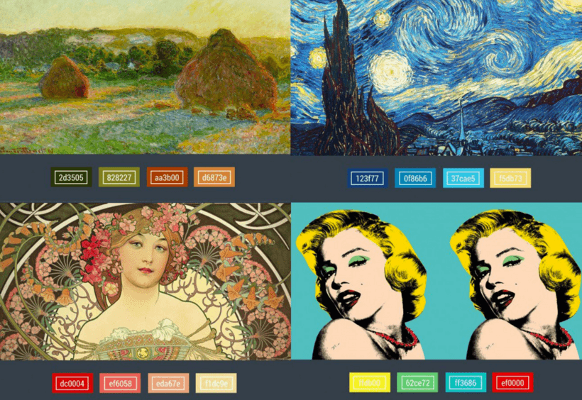
Picture is taken from Canva Design school
- Pinterest is your best friend in design inspiration
Pinterest has an impressive amount of color palettes created by leading UX designers all around the world. For example, Ian Barnard, creator of Vintage Design Co., explained his search process below: “If I was doing a design for a beach project, I would do a simple search under ‘Summer Color Palettes’ and choose one”
Also, it is a great tool to save what you love. So that you can use later on in your designs. Nicky Laatz, owner of a typography and design shop, shared how she stores stunning color palettes for later use: “Whenever I see a picture or photo with colours that I love, or that really seem to go well, I pin it. Then, when its time to find a good color palette, I go to all my saved images for inspiration and I always find something appropriate.”
- Use photos for color schemes
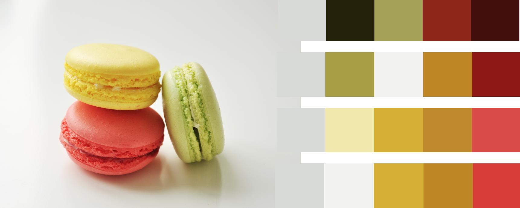
One of my favourite ways to create a color palette is to use photos that I love. It is a very simple and very effective way! It saves your time and you have more fun finding the right combination of colors for your project.
There are a lot of tools that can do this automatically for you, for example, I always use Adobe Kuler. There you can search for photos on Flickr, or you can upload your own image.
If you have a smart phone, try playing with the Adobe Color App. You can take a photo of anything and the app will automatically detect colors and create color palettes directly from your photo!
One of the coolest features Kuler has for creating color schemes from images is their “Select a Mood” option. It Includes dark, deep, muted, bright. Look at this example:
11. SHARE YOUR DESIGN AND GET FEEDBACK
Use colourlovers.com – creative community where people from around the world create
and share colors, palettes and patterns, discuss the latest trends and works.
Don’t forget about A/B testing and other UX research tools, see how your target interacts with your app or web, get their feedback. Do testing in every stage of your progress, always get approval from your target to create a dream product.
LATEST WEB DESIGN COLOR TRENDS
Other than tips on how to chose the right color for your web design project, I think it’s important to always check the latest web design color trends and to consider them while working on a design. So here are some of the latest web design color trends in 2016:
- Material design. It is a richer alternative to flat design because it uses shadow effects and the concepts of movement and depth in order to create designs that appear more realistic to the user. The goal of material design is to create clean, modernistic design that focus on UX
- Minimalistic design, simpler color schemes. Color palettes are becoming softer and more muted to give users’ eyes a rest.
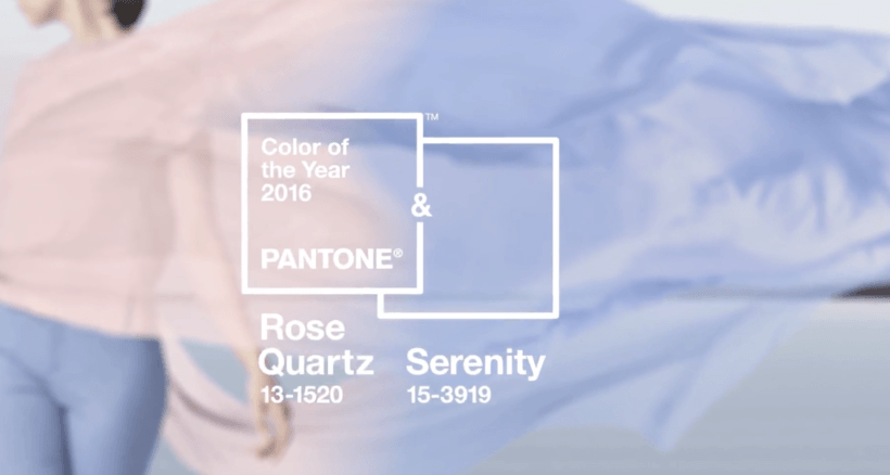
- “Rose Quartz” and “Serenity” – pantone’s color of the year. As consumers seek mindfulness and well-being as an antidote to modern day stresses, welcoming colors that psychologically make us rest, are becoming more trendy. For example, Rose Quartz and Serenity create balance between a warm rose tone and the cooler peaceful blue, reflecting calm and relaxation.
- Bright, bold colors. They are also used by a lot of leading designers as a way of standing out against monotone designs. They use them to make people focus their attention on important elements and make their design memorable. Typically they are used with only a few other primary colors, these designs often have lots of “white” or “grey” or monochromatic scheme in order to have a better effect of bright colors – high contrast. This is effective because the monochrome palette sends an emotional or psychological message, while the accent color calls attention to important page elements and guides the user’s eye.
- Rise of subtle gradients and blended hues.
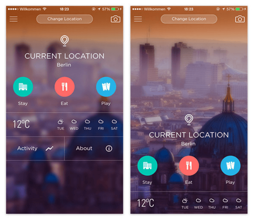
- Blurred, transparent elements. When Apple introduced iOS 7 they introduced a new trend as well – translucent UI elements. It is a great way to make people focus more on the sharper elements that are on top.
SHOWCASE OF SUCCESSFUL COLOR PALETTES
Choosing the right color scheme is essential to your success. Your layout and other design choices should be designed taking into account your color scheme to ensure readability, cohesiveness, beauty and balance in your final product.
Sometimes, making this choice or creating a color palette from scratch can be a challenge. Creativity and inspiration don’t come when they want, sometimes designers can go for a coffee and find a cool building with colors that could be used for the project.
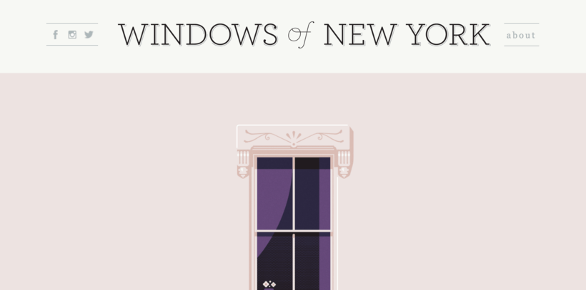
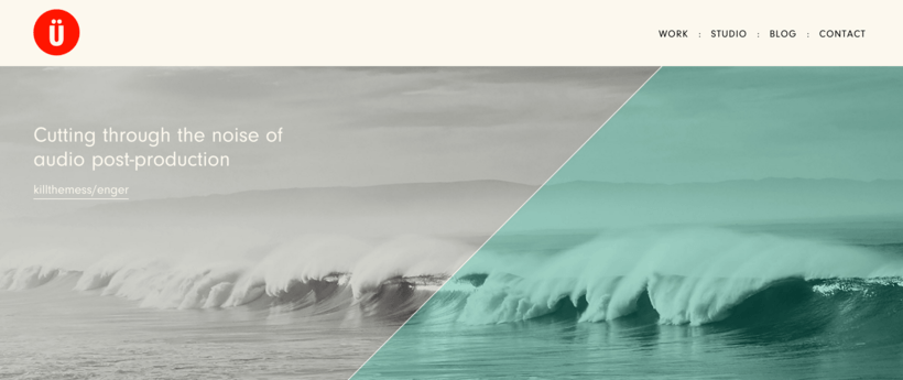
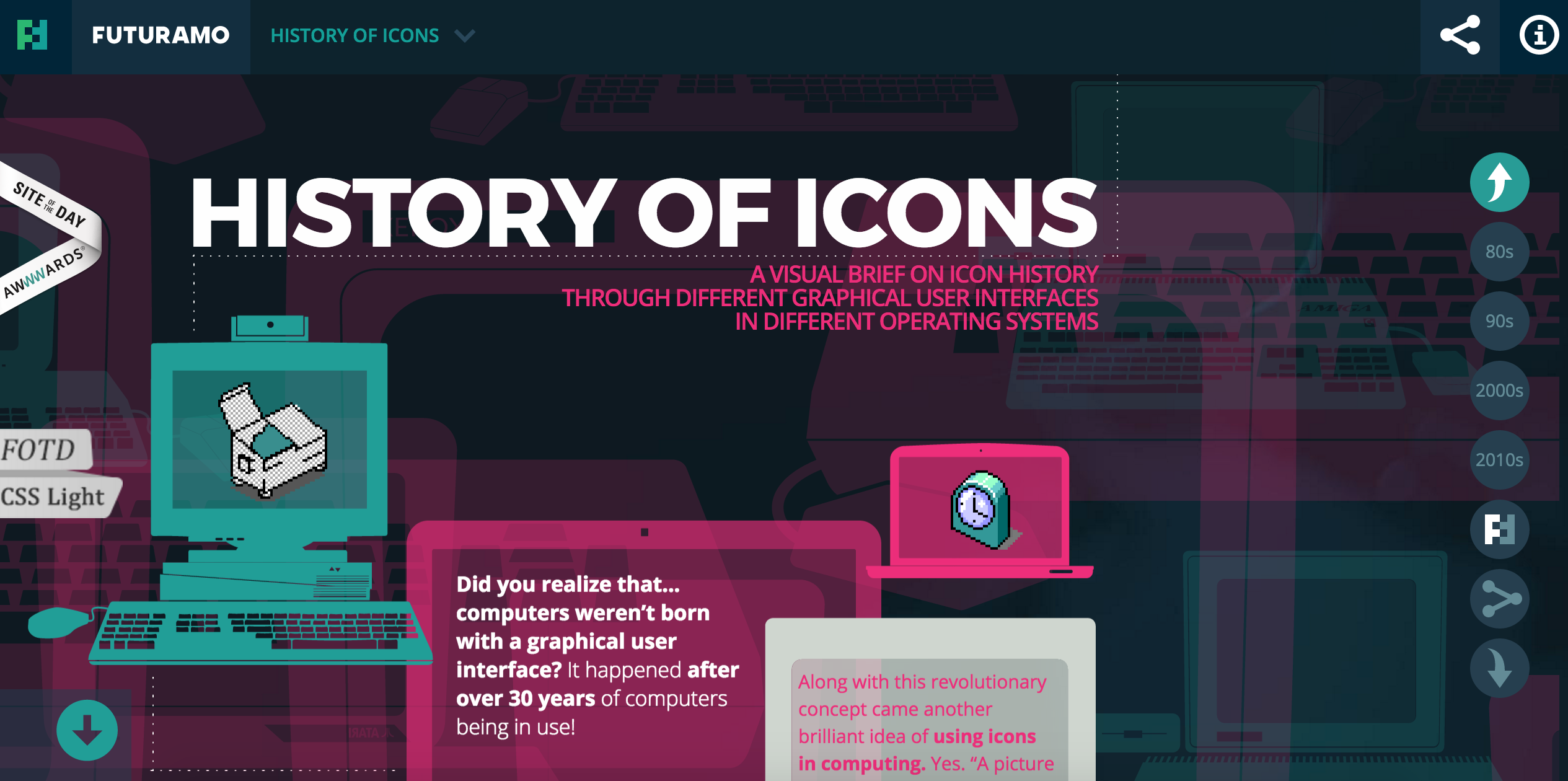
Most of us are visual people and instead of just writing explanations, we prepared some cool examples that can inspire you for your next designs.
WINDOWS OF NEW YORK
TRUF
SIMPLISAFE

HISTORY OF ICONS
I hope it will help you with your future web design projects! My next articles will be about how color influences sales based on statistics and useful tools for color combinations.
Don’t miss it, subscribe to our monthly newsletter!
Author
-
Ekaterina Novoseltseva is an experienced CMO and Board Director. Professor in prestigious Business Schools in Barcelona. Teaching about digital business design. Right now Ekaterina is a CMO at Apiumhub - software development hub based in Barcelona and organiser of Global Software Architecture Summit. Ekaterina is proud of having done software projects for companies like Tous, Inditex, Mango, Etnia, Adidas and many others. Ekaterina was taking active part in the Apiumhub office opening in Paseo de Gracia and in helping companies like Bitpanda open their tech hubs in Barcelona.
View all posts

